Cardboard: No limit, and no video
An hour with Cardboard across two days, and it never made me a video. It turned me away four times instead. Here is what I found, and what I would build instead.
What this is
An independent teardown. Self-directed and unpaid
Analysed
One free account, about an hour across two sittings, September 2026. No subscription at any point
Method
The changelog read before signing up, then the product walked by hand at laptop width, every quoted line captured on screen
Independent. Not affiliated with, commissioned by or reviewed by Cardboard. One free account, from one person, across two sittings, so another run may not look like this one. Every line quoted here was on screen when I captured it. The pricing page has changed since, and the piece says where.
Cardboard is an AI video editor that runs in the browser. You hand it footage, tell it what you want, and a feature called the Director plans and makes the edit.
I read the changelog before signing up, so I went in with a question rather than a blank slate. There is plenty in the last four releases about what the product can do. v0.38 moves the start of a project from an empty prompt box to your own clips, and cuts one measured export from 35.4 seconds to 11.6. v0.39, headed Fewer Surprises, has the Director check its own edit against what you asked for before it calls the job done. v0.40 is a steadier Director and twenty-one caption styles. v0.41, the release before I signed up, is a Director that says when it is stuck.
Three releases in a row on the same feature.
Does using it feel the way the changelog reads?
The good part
I uploaded six images from August, most of them with text on them, and asked for a 30-second reel for Instagram. Then I added one line to the prompt: the images have text in them, so give the viewer time to read each one.
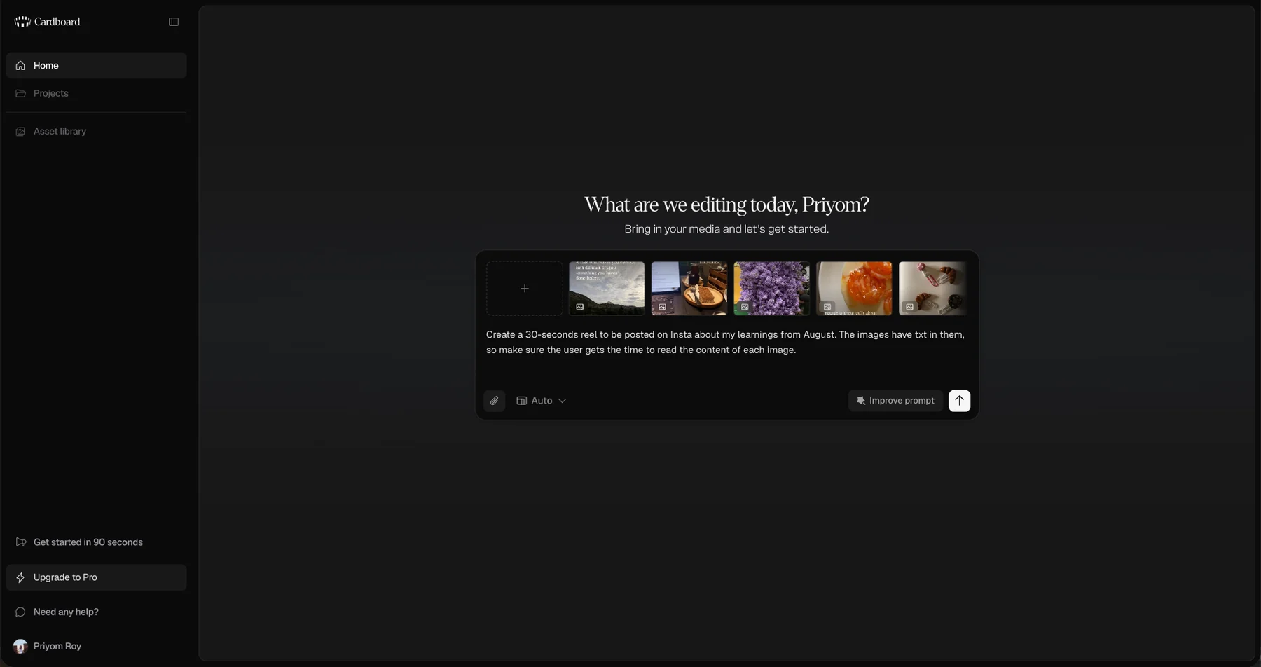
It scanned the clips, planned the edit, and came back with this:
Your August learnings reel for Instagram
Sequence the six clips · Adjust timing for text readability · Add transitions and background music
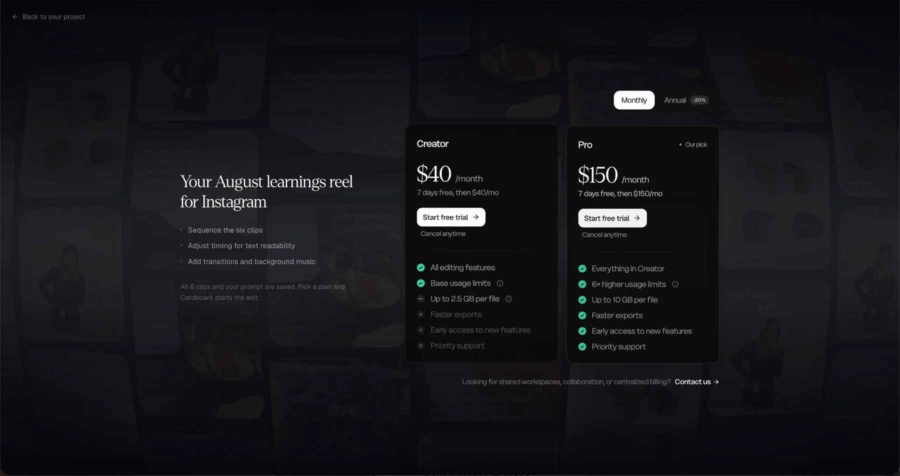
The second line is the one that matters. I asked for reading time and it said reading time back to me, in its own words, before it did anything. That is the product proving it understood me.
It is also where it stops and asks for a subscription. I am not making a pricing argument; someone has to pay for the render. The odd part is that this is where the product explains itself best. The plans sit side by side and each one says what it gets me. The screen whose actual job is to tell me that told me nothing.
The rest
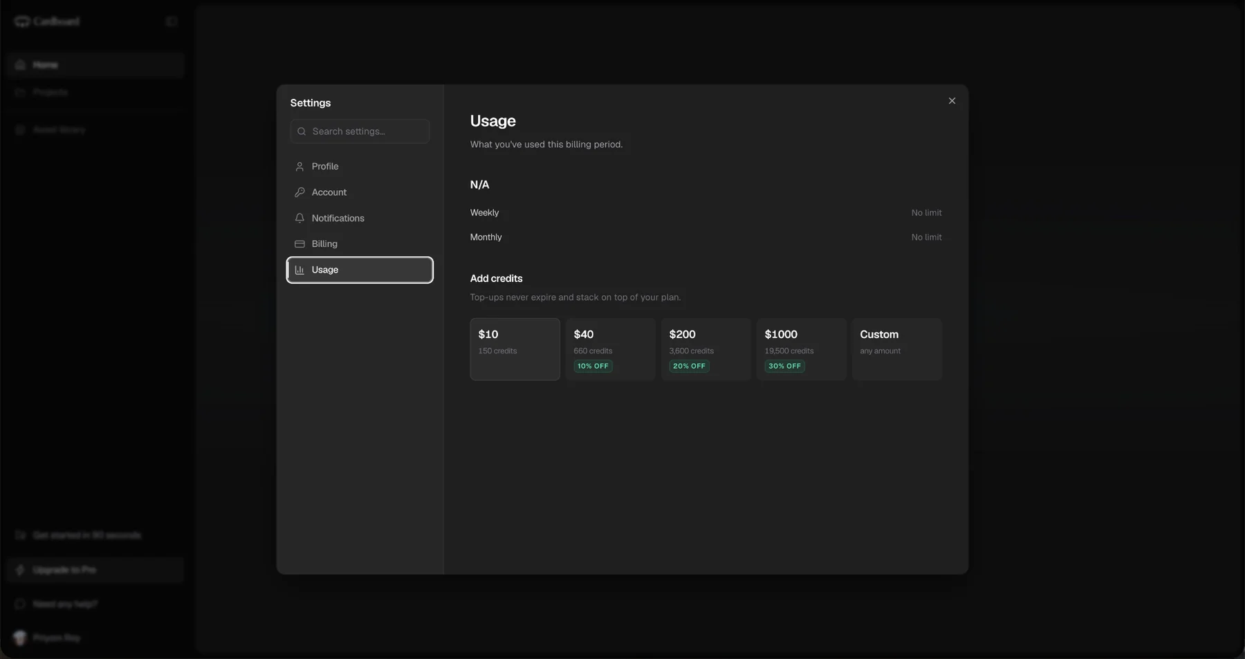
Usage told me I had no limit. Under Settings, the Usage screen read N/A at the top, then No limit weekly and No limit monthly. I had no subscription and could not produce a single second of video.
The screen whose job is telling me what I can use told me I had no limit, and I believed it until the product contradicted it.
A variable name, shown to a person. I clicked Add credits on that same screen and got a toast at the top of the window that said no_subscription. That is not a sentence. It is an internal string, shown to a person, at the moment they are being refused.
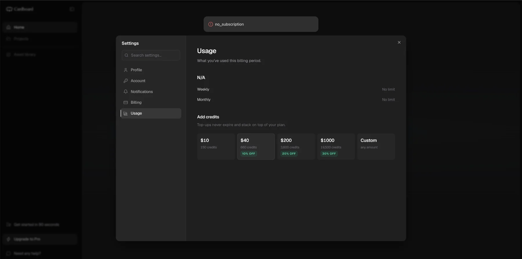
Someone who sees it learns two things: something is wrong, and nobody wrote this part. This is what I keep returning to in AI products. The effort goes into what the system says when it works, and almost nobody designs what it says when it is out of its depth. The happy path gets a voice. The error states, the edge cases and the paths that are not the straight line do not.
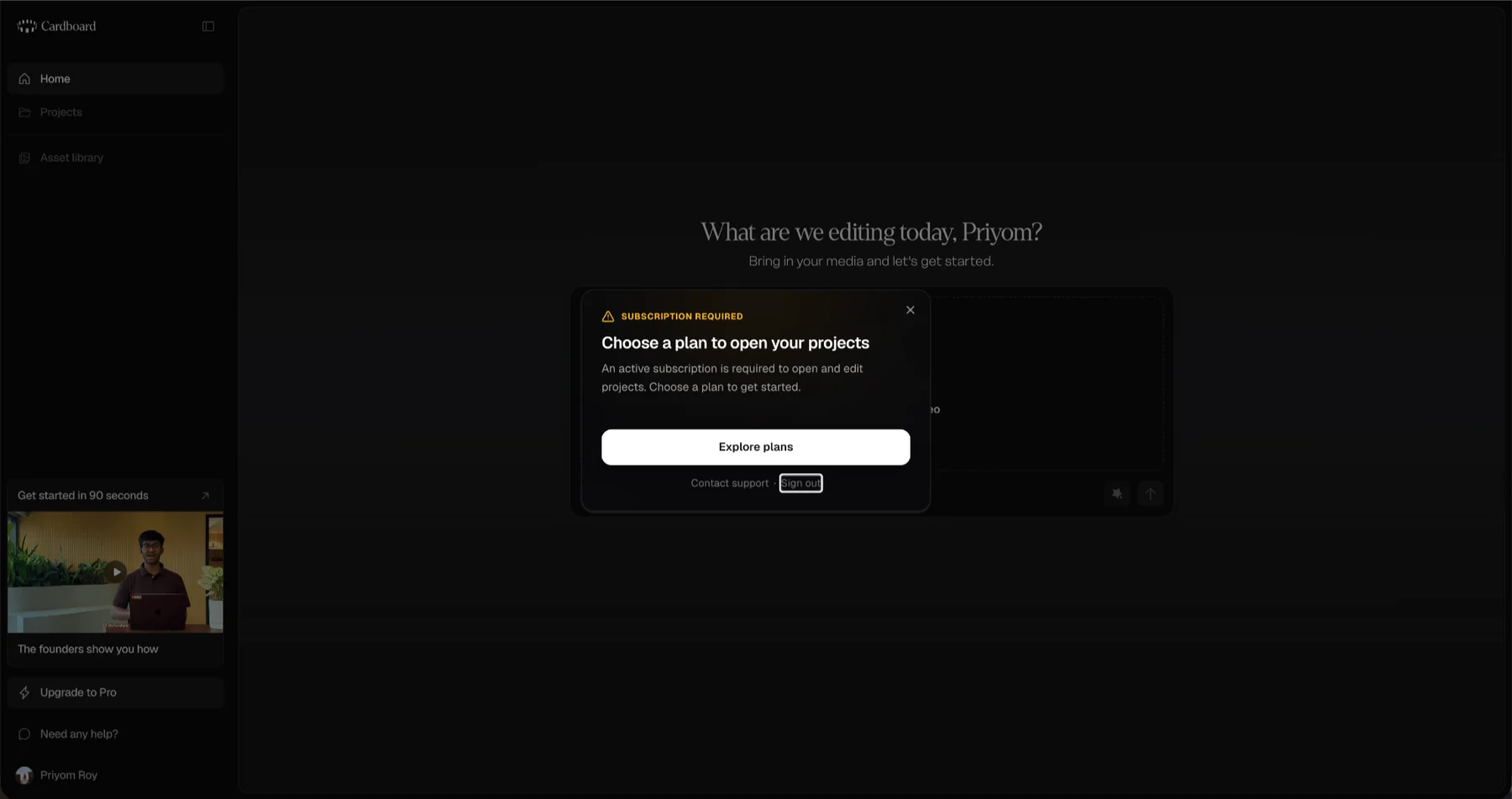
Projects and Asset library open, then say they are paid. Both sit in the left nav and both are clickable. I clicked them and got a dialog headed Subscription required, telling me to choose a plan to open my projects. Same shape as Add credits: I am allowed to act on something I am not entitled to, and find out afterwards.
Two trial lengths on one page. The pricing cards said Start 7-day free trial, with 7 days free, then $40/mo above the button. The footnote directly beneath those cards said first-time subscribers can start with a 3-day free trial. Both on screen at once.
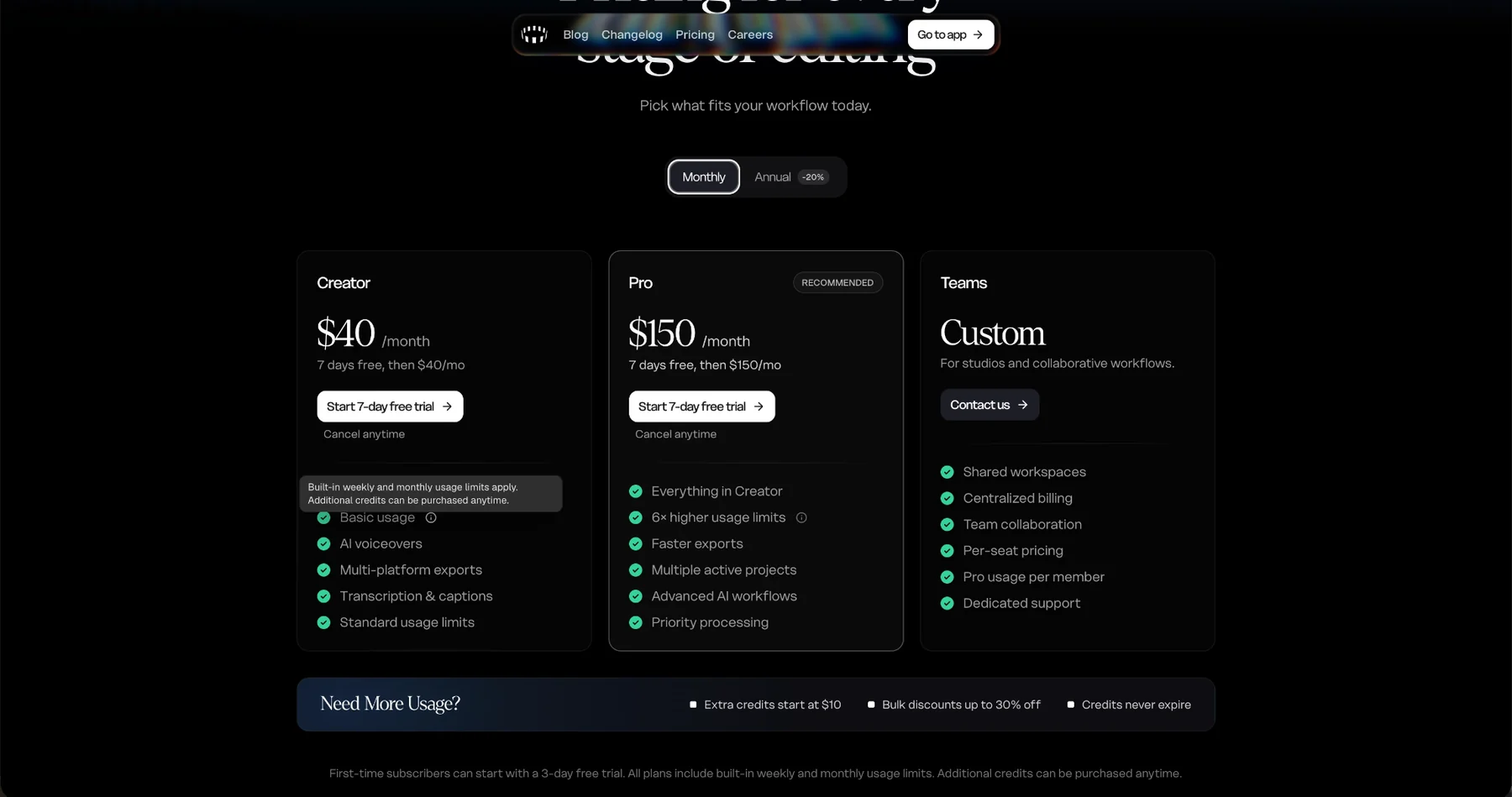
That page has since changed. Re-read on 21 September 2026, the buttons say Get started, the monthly prices read $32 and $120 rather than $40 and $150, and the only trial length anywhere on the page, cards and footnote and FAQ alike, is three days.
The free tier, rebuilt
I rebuilt the part of Cardboard a person sees before they pay. Four changes are made in it, and three of them are below.
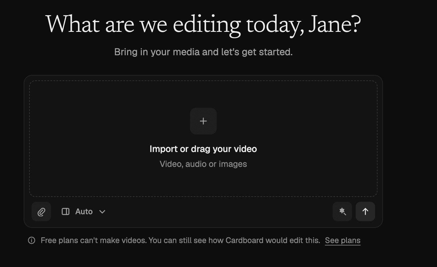
The composer says what a free account can do with it. One line under the box, before anything is uploaded: a free plan can plan an edit, not render one.
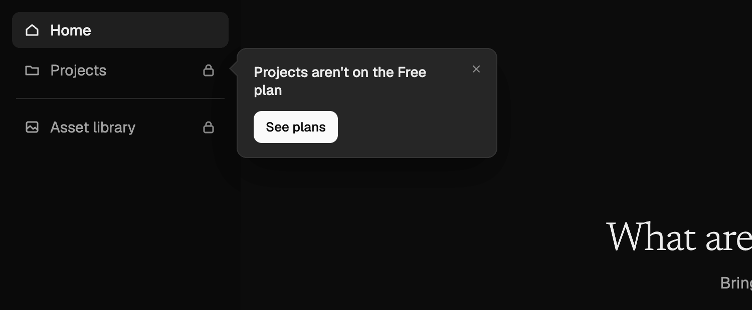
The sidebar marks what is locked, and explains it in place. Projects and Asset library carry a padlock, so the refusal arrives before the click rather than after it. Clicking one says which plan it needs, beside the item, instead of a dialog over the whole screen.
Usage answers the question it is named for. What you can do on this account right now, rather than a limit that does not exist.
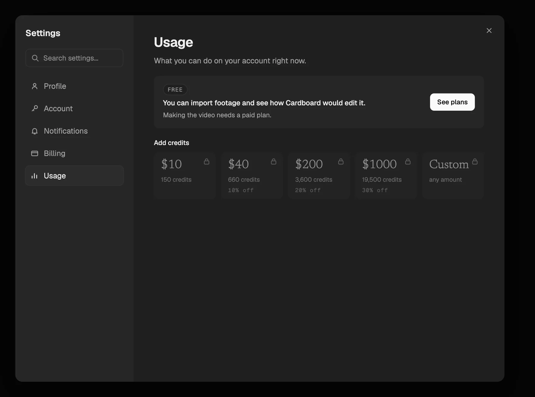
The fourth change is the one I have left out of the screens above. The pricing page says three days in the cards, in the buttons and in the footnote, rather than seven in two places and three in a third. Cardboard has since fixed that on the live site, so the prototype is agreeing with them rather than proposing anything.
The rest of it is a prototype and not a proposal Cardboard has seen. The account in it is sample data, and it is built for a laptop screen.
What I could not check
I never saw how Cardboard makes a video. Everything above is what happens before the editing starts. I have nothing on whether the cuts land, whether the pacing works, or whether it finds the right moment in a long stretch of footage. Those are the things someone actually buys this for, and they are not in my notes.
The reason is the trial. It begins after you pick a plan. Until then the product will take your footage, read your prompt, and tell you what it intends to do, and then it stops. So I would have to pay before I could judge the thing I would be paying for.
Rendering costs money every time someone runs it for free, so I understand why the line gets drawn somewhere. I still spent two days with Cardboard without watching it edit.
Smaller things I wrote down
Onboarding asks How did you hear about us? twice, once by category and once by channel, under the same headline both times. It reads as a loop rather than a drill-down.
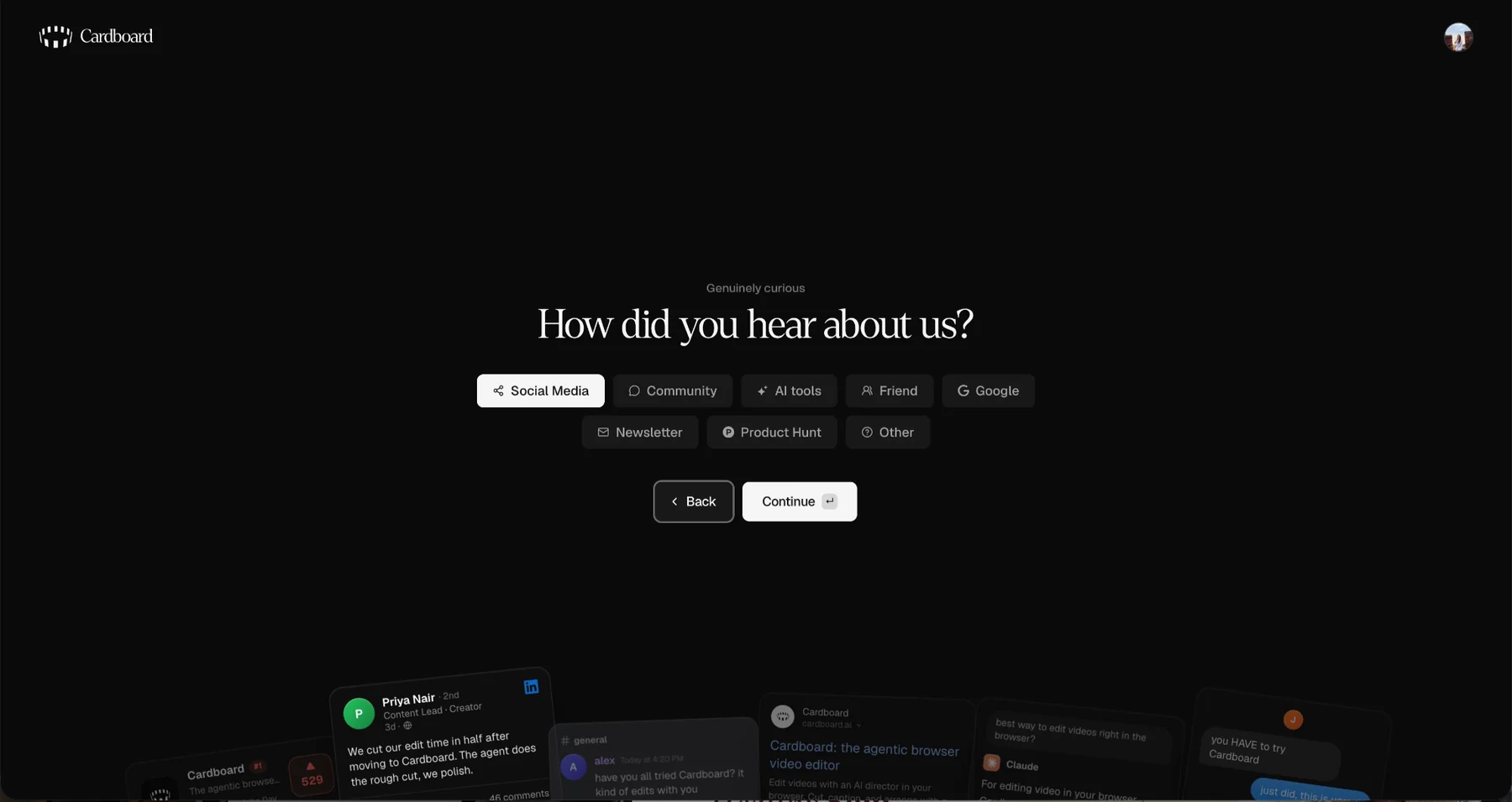
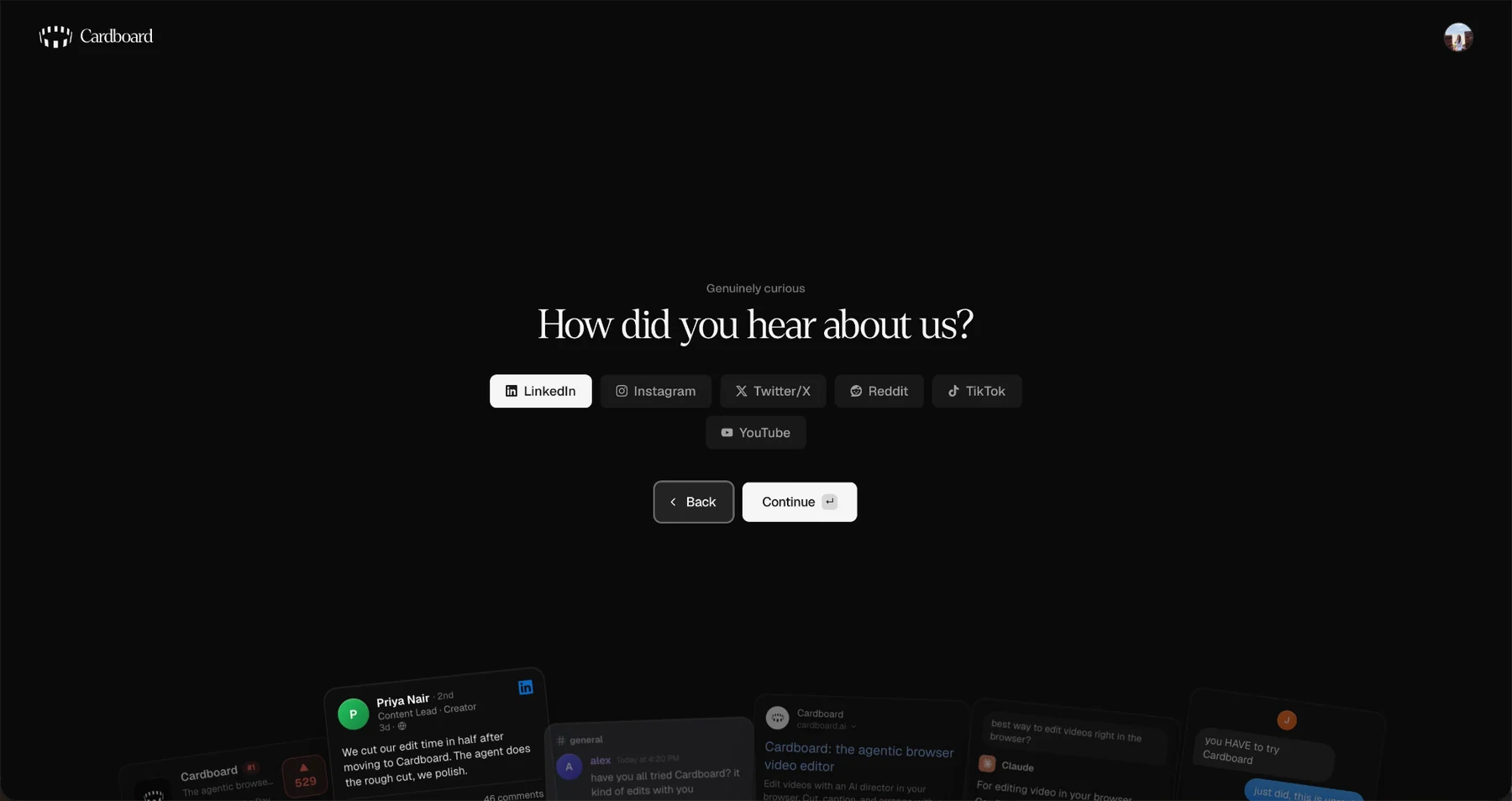
- •Usage lives inside Settings, which is a lot of clicks for the number a person on a metered plan checks most often.
- •Icon-only buttons carry no tooltips.
- •Need any help? offers a call and a phone number, and some people would rather write in.
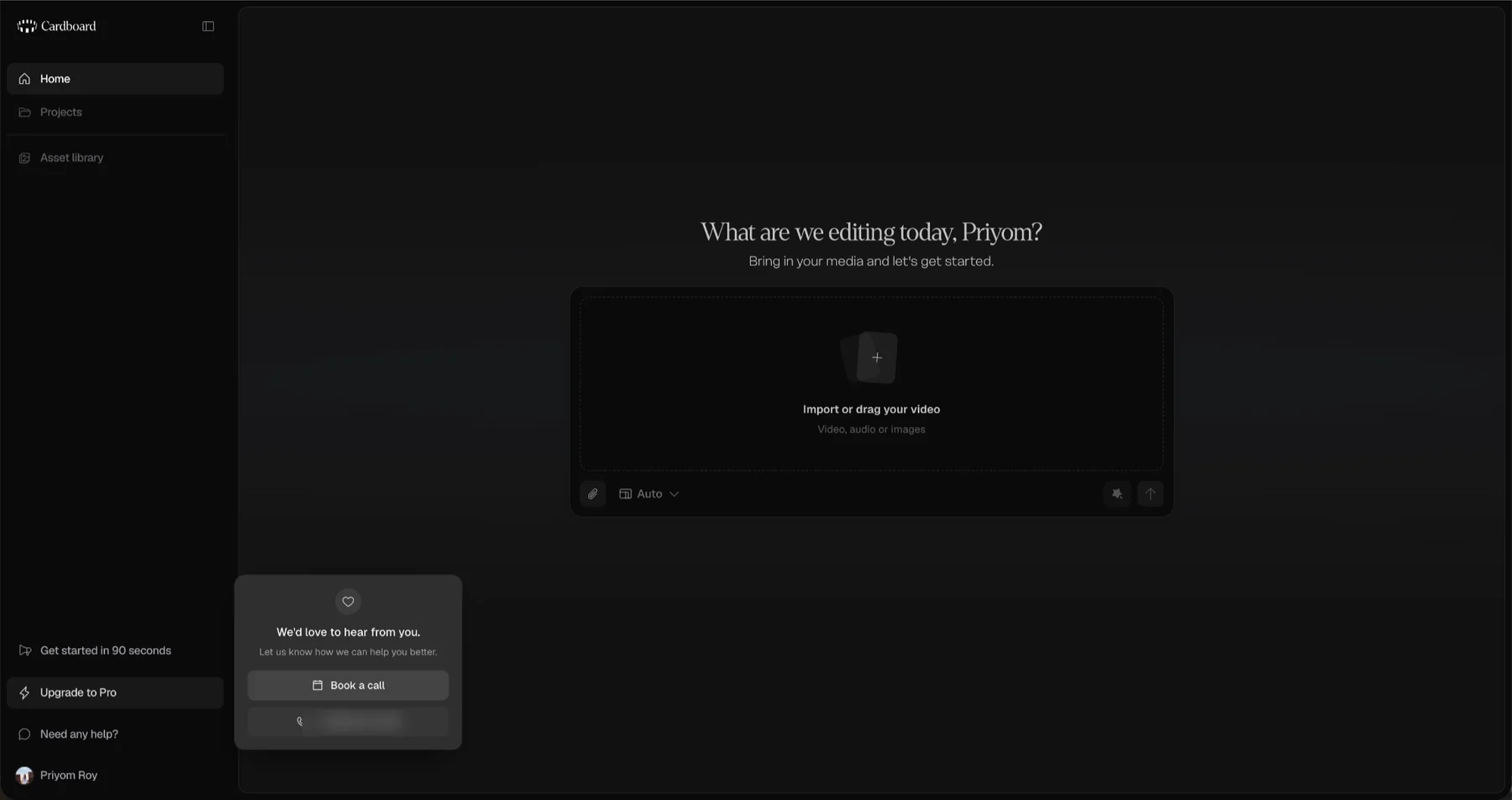
The founders’ walkthrough in the left nav is good, and personal in a way an onboarding video usually is not. It is the only place in the product where somebody explains what to expect.
What I would do
- •Work out what the app says to someone who has not paid. The Usage screen shows what you have used and what you have left. Mine said no limit, weekly and monthly, while I had no plan and could not make a single video. It reads that way because it was written for people with a subscription, and nobody has decided what it should say to anyone else.
- •Pick one way of saying no, and use it everywhere. Four things turned me away and they did it three different ways: two locked features in the sidebar opened and then told me they were paid, a button gave me a raw error, and the render gave me a full page of pricing. Mark what is outside the free tier before it is clicked, rather than after.
- •Write the moments where the product refuses. When I clicked Add credits without a subscription, what came back was no_subscription. That is a variable name, shown to a person, at the moment they are being refused. The edge cases and the error states deserve the attention the happy path already gets.
- •Keep the plan numbers in one place. The pricing page sold a 7-day free trial in its buttons and a 3-day one in its footnote. One number, wherever it appears.
Resources
Everything else here is first-party, read off the product by hand at laptop width on a free account.