Kiwi: The people it turns down
I applied for a Kiwi credit card on a Thursday evening, from a Google ad, on a laptop. I was refused, so I never saw the product. I did see everything that comes before it, and some of it does not agree with itself. Here is what I found, and how I would rebuild it.
What this is
An independent teardown. Self-directed and unpaid
Analysed
One application, refused · 10 September 2026 · Site copy re-read 11 and 13 September
Method
The application walked by hand, every quoted line read off the live site at laptop width
Independent. Not affiliated with, commissioned by or reviewed by Kiwi. One application, from one person, on one evening, so another run may not look like this one. Every line quoted here was live on the dates above and may have changed since.
Kiwi sells a credit card that runs on UPI. The line on the landing page is India’s best credit card for UPI, and the offer sitting next to the sign-up box is flat 10% off at PVR, Starbucks, Domino’s and McDonald’s. It asked for my phone number, sent an OTP, and once I was through that, asked for my PAN and my date of birth.
PAN is not a small thing to hand over. It is the number my entire credit file hangs off. So the question I ended up with is narrower than the one I started with.
What does this product say to the people it turns down?
The good part
The form is short and it does not waste your time. Phone number, OTP, PAN, date of birth, done. No income, no employment, no address, no upload, no twenty fields before a no. Plenty of lenders make you earn the rejection first.
The refusal itself is more careful than most:
We tried. No offer available.
Unfortunately, you do not meet the bank’s criteria for the credit card at the moment. But don’t worry, we’ll reach out to you in case something changes
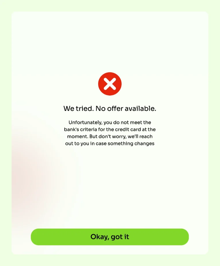
Two decisions in there are right. It says at the moment, so it is not pretending this is permanent. And it says the bank’s criteria, which is honest about who actually made the call. A lot of products in this category would let you believe the app decided.
Someone wrote that sentence on purpose. That is the part worth saying first.
The rest
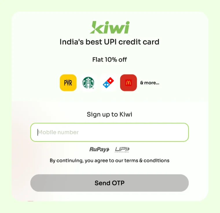
The Apply now button never arrives at an application. When I went back to the Kiwi homepage and pressed Apply now, the page it opened was headed India’s best UPI credit card, and the box under it said Sign up to Kiwi. Nothing on that page says apply. The button asks me to apply, and the page asks me to sign up.
That word does more work than it looks like. Signing up makes an account, or so I assume, and an account is what the product found when I came back twenty minutes after being refused.
The wait explained nothing. After the PAN details page, I got a white card with three dots in the middle of it, and it sat there for over a minute. Somewhere behind it, something was being checked against the PAN I had just typed in. The screen did not say that. Checking with the bank would have cost nothing and would have told me the truth.

“Offer” did two opposite jobs ninety seconds apart. The screen that took my phone number sold me an offer: flat 10% off, four logos, & more.
The screen that turned me down said No offer available. The word that pulled me in is the word that put me out.
It promised to reach out, and did not say how. We’ll reach out to you in case something changes. Changes how, and found out by whom? They have my PAN, so they can go and look. Maybe they do. Nothing on that screen tells me whether anyone is watching, on what schedule, or what I could do to make the answer different. It is a kind sentence with nothing underneath it.
Twenty minutes later it told me I was already a customer. I went back to try again. What came up was this:
Already a Kiwi User It seems that you are an existing Kiwi customer. You will be redirected to the Kiwi app in 3 seconds to check the status of your application.
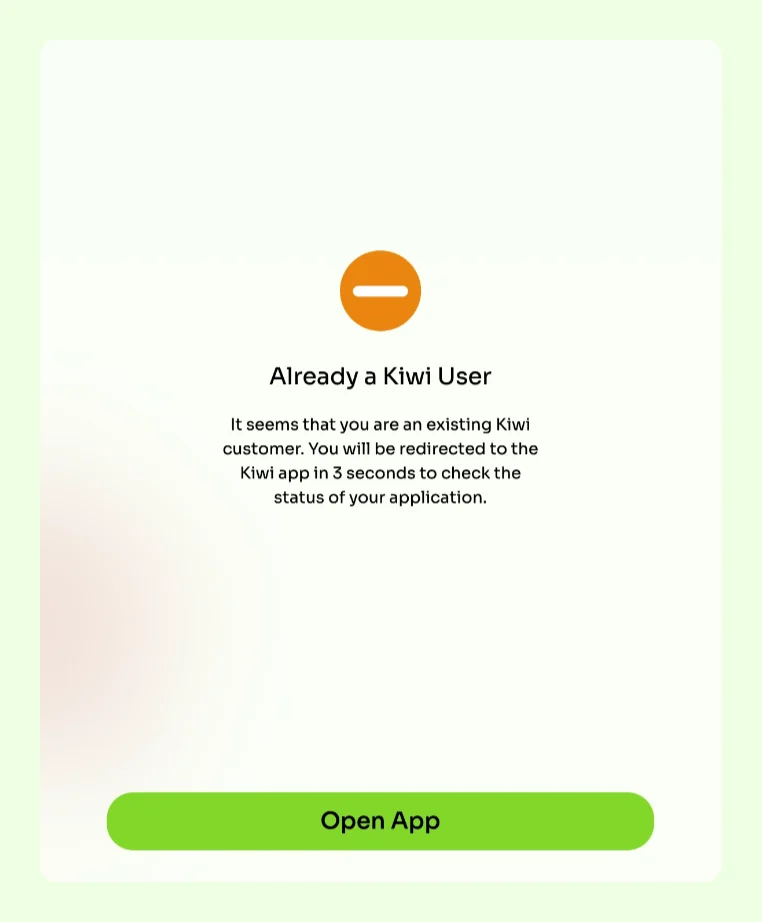
At 7:36 PM IST I did not meet the bank’s criteria. At 7:56 PM IST, I was an existing customer with an application to check. Both of those cannot be true.
I assumed applying created an account, and the retry recognised my number and sent me down the road built for people who got in. Seemed like the interaction was created for approved users and it is the one now doing the talking to one who got refused.
The website
While I was on the site, I read through it as well, which is a habit, as a person who has come up from the content side of things, and not a plan. And here are the things I discovered that I wanted to share.
Each of them is small on its own. What makes them worth writing down is that the site somehow gets every one of them right somewhere else.
Everyday
Everyday and every day mean different things.
- •Everyday, one word, means ordinary: your everyday card.
- •Every day, two words, means each day: I pay on UPI every day.
In these three lines the site means each day, so they need two words:
- •A little more rewards, everyday. (homepage)
- •Adding more to the list, everyday (homepage)
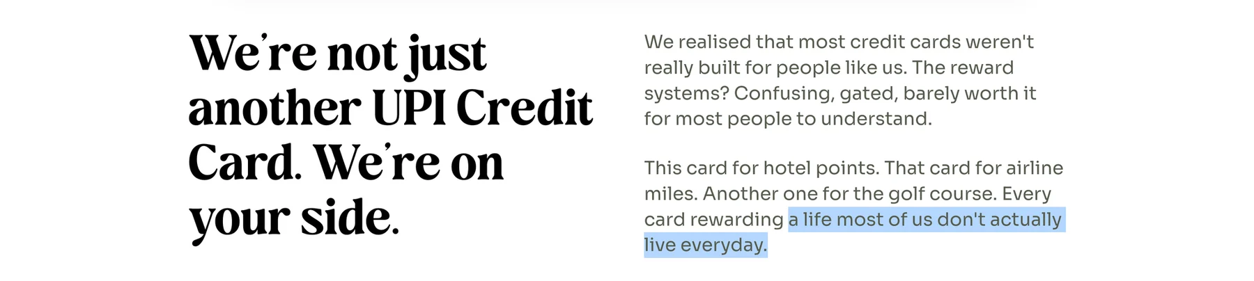
- •a life most of us don’t actually live everyday (About us)


The AU Bank card page gets it right: Meet your everyday UPI credit card.
The Kiwi app
Two cards in the same homepage rewards row:
- •Track all your spends & manage your cards on Kiwi app
- •Get amazing discounts on exciting brands on the Kiwi app
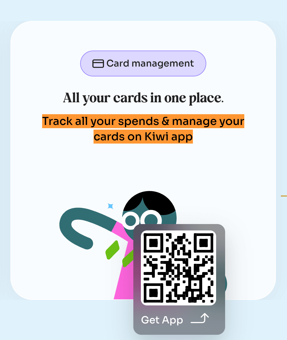
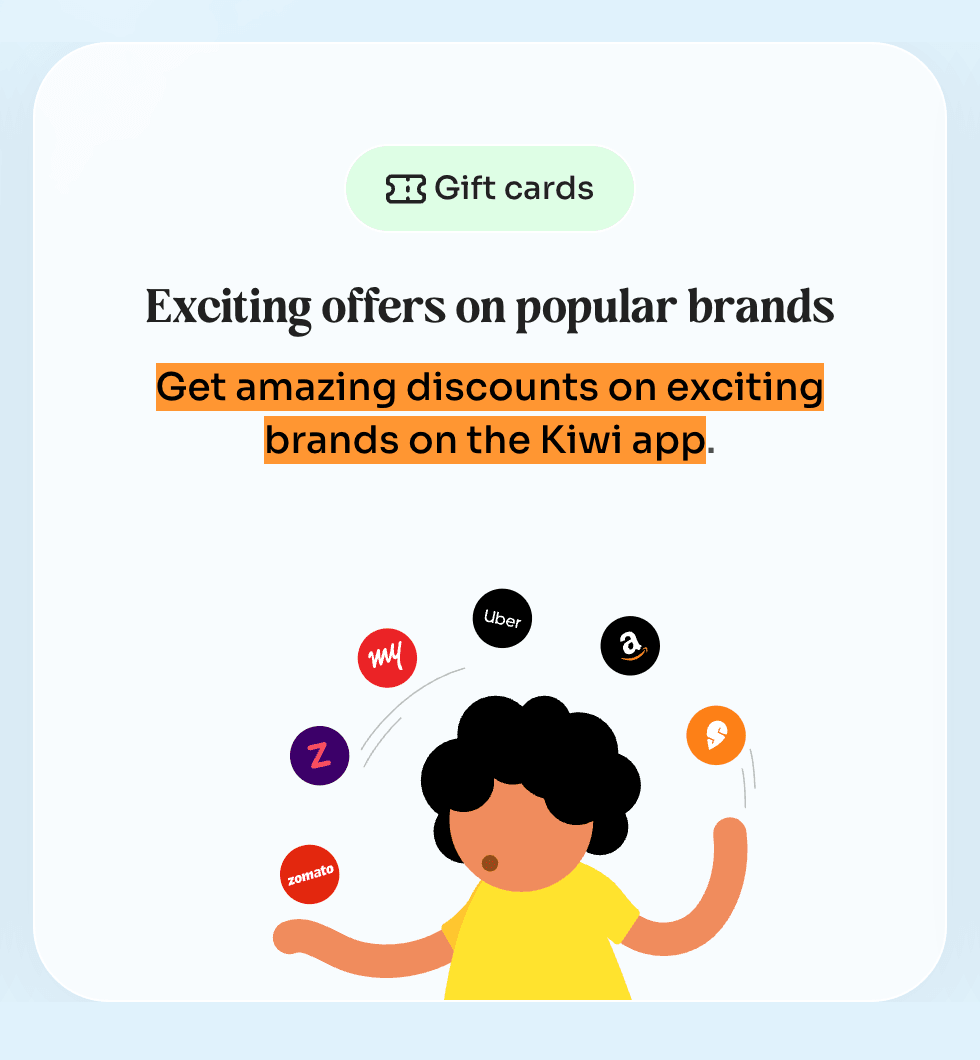
One has the article and one does not. While using an article is optional, consistency is the issue here.
What these have in common
I wouldn’t say this is bad writing. Each one is right somewhere on the site and wrong a few lines or a few pages away. The knowledge is already in the building. What is missing is somebody whose job is to carry it from one card to the card sitting beside it.
That reads as pedantry when it is commas. It reads differently when it reaches the money.
The path, rebuilt
I rebuilt the walk I had just taken, from the homepage through the OTP and the PAN screen to the refusal, and then back again twenty minutes later. The changes below are made in it: the wait says what is being checked, the refusal and the retry agree about my status, and the screen that turns me down explains what happened to my PAN.
It is a prototype and not a proposal Kiwi has seen. Every name, number and card in it is sample data, no bank is named, and the wait resolves in about ten seconds rather than the minute I sat through, because nobody should have to wait out a real one to look at a demo.
What I could not check
I never saw the card, the app, or a single transaction. Everything a person actually buys this for is missing from these notes, and the reason is that I would have had to be approved to see it.
I also do not know whether the check they ran against my PAN was a soft one or a hard one. The screens do not say, and there is no way to tell from the outside.
Smaller things I wrote down
- •The three-second timer on that redirect is shorter than the sentence explaining it. Thirty words, three seconds, and the only button on the screen is Open App, which makes it happen sooner. There is no way to stay.
- •The refusal wears a red cross. Being told I already had an account wore an orange minus. Neither of those is an error. The product has one icon vocabulary and it is the one for things going wrong.
- •The top navigation on the application site sells Kiwi Partner Cards. The refusal screen offers me nothing at all, just a button that says Okay, got it, which is a strange thing to make someone press about a card they wanted and did not get.
What I would do
- •Decide what this product says to the people it turns away. They are most of the people who will ever reach that screen. Right now they get a red cross, four sentences and a button, from a company whose front door is built for the ones who get in.
- •Let the page finish the button’s sentence. If the button says Apply now, the page it opens should say Apply for a Kiwi credit card, and tell me up front what I will be asked for: my mobile number, my PAN and my date of birth. I would have known what I was handing over before I typed a single digit.
- •Say one thing about my status, not two. If the answer is no, every screen after it should know that. The retry path is currently reading from a script written for somebody else.
- •Say what happened to my PAN. What was checked, what is kept, for how long, and how I get it back if I want to. That paragraph belongs on the refusal screen, not in a policy I would have to go looking for. It is also the cheapest trust the product will ever buy.
- •Give me a way to stay on the page. Three seconds is not reading time in anyone’s first language, let alone their second. Add a cancel, or take the timer off, or let the button mean stay.
Resources
Everything here was read off the live site by hand at laptop width, on 10, 11 and 13 September 2026.