Restructuring an IA around how things actually relate

Grouped by screen, or grouped by how things really relate?

Role

Product Designer & Content Strategist, end to end. Information architecture, interaction design.

Context

Accolade, 2025. B2B proptech SaaS.

Outcome

Three moves under one principle: link, nest, separate. Built, defended to leadership

The product

Accolade is a B2B SaaS platform for multifamily property operations: leasing and maintenance across a whole portfolio of communities and units. That's a dense web of related entities, which is precisely what this project set out to reorganize. For more information, see www.accoladehq.com

The chair

I came into product design through writing, so before I ask how to build something, I ask what it's for. On this project that instinct was the job.

Context

At Accolade (B2B proptech SaaS) I design features end to end. On this work, framing, PRDs, interaction design, and content all sat with me, and I owned eight features this way. This one arrived as a mandate: copy a well-funded competitor's information architecture for communities, units, and unit types. The reasoning was "they're funded, so they've figured it out."
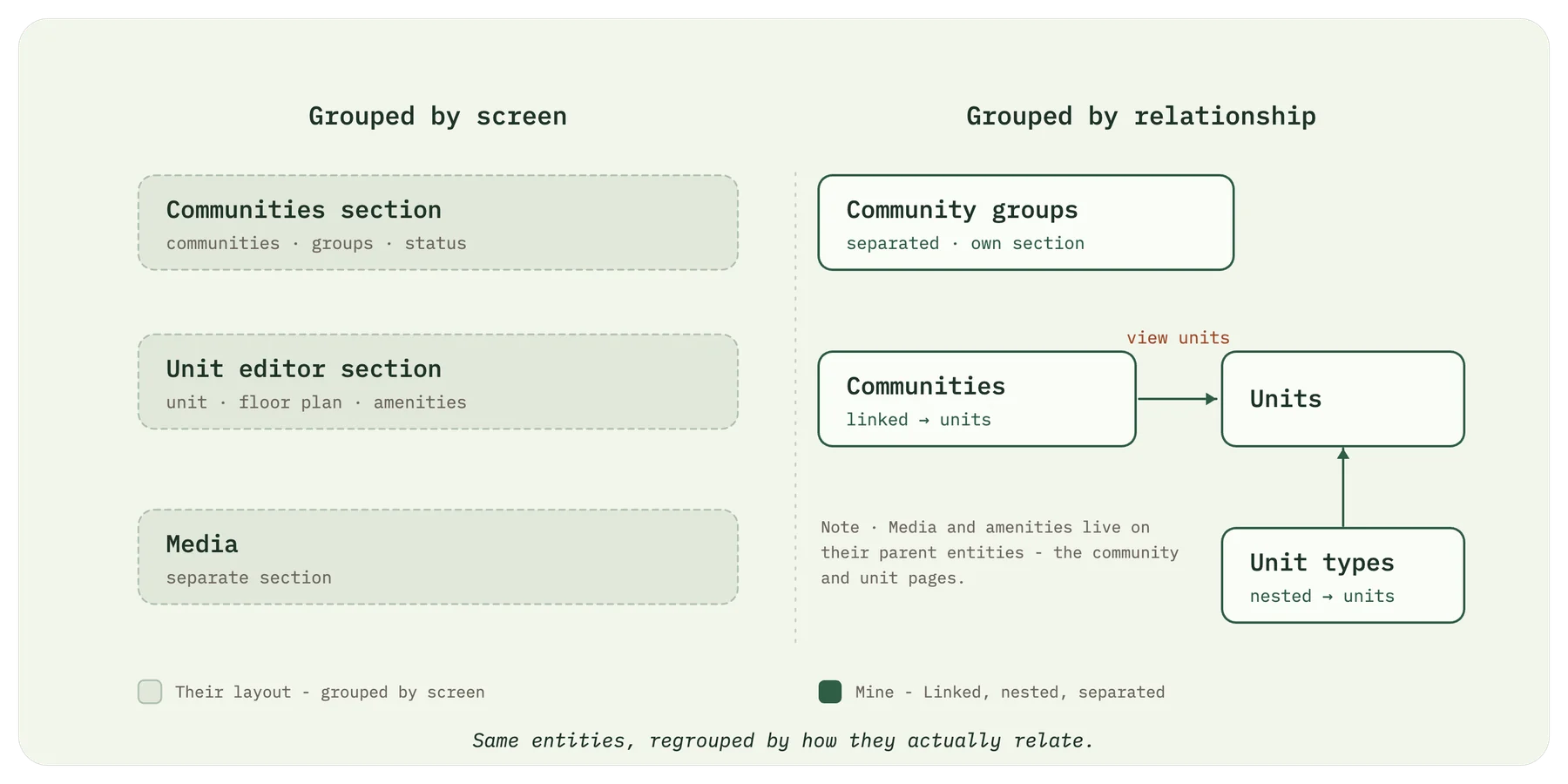
Same entities grouped by screen versus grouped by relationship: Communities linked to Units, Unit types nested under Units, Community groups separated into its own section; Media and amenities live on their parent community and unit pages

The same entities, regrouped by how they actually relate.

The question

Instead of mirroring their layout, I asked what these things actually are and how they relate. Three things didn't add up:

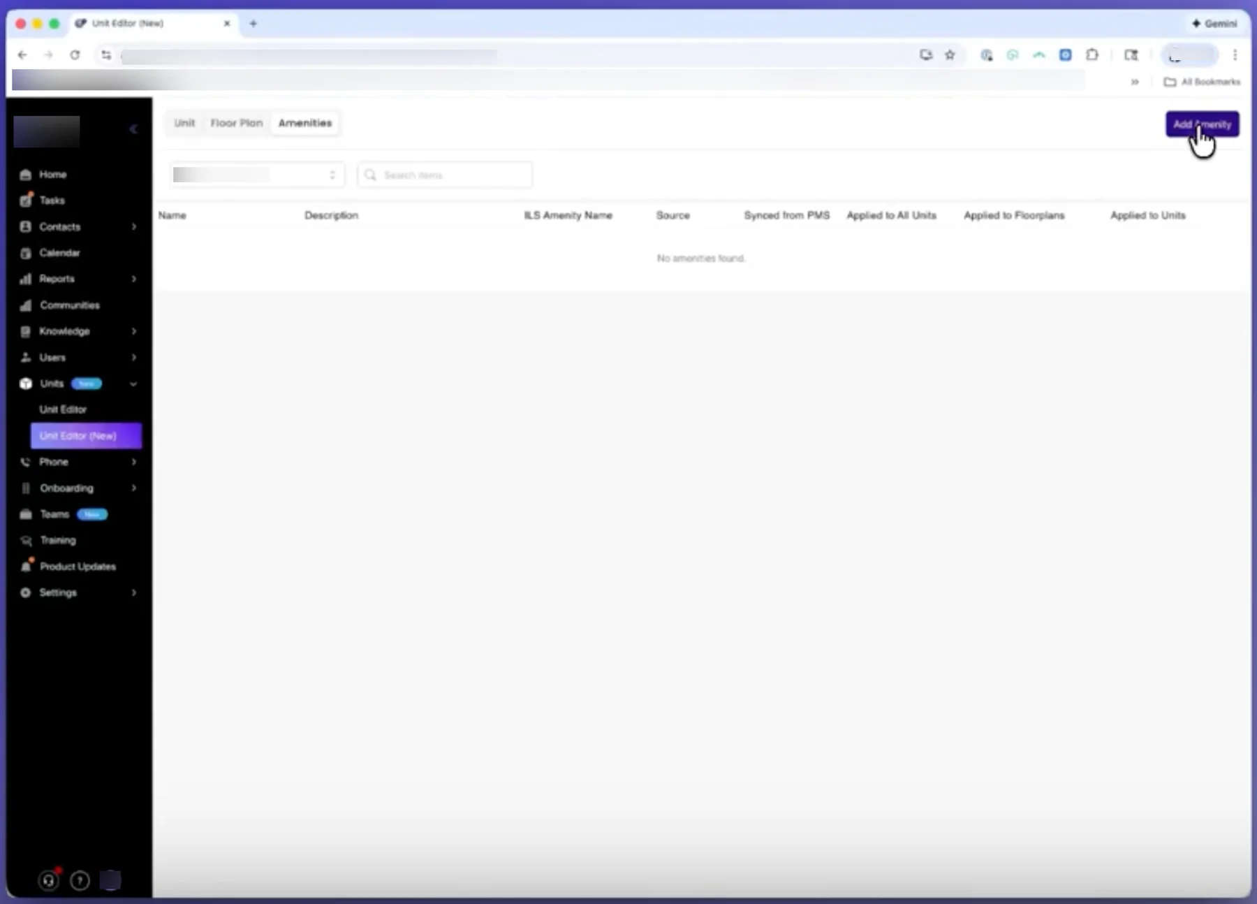
  • 1Communities and units lived in two separate sections with no link, even though a unit belongs to a community.
  • 2Units and unit types sat as peer tabs, even though a unit type is the parent and units are its children.
  • 3Community groups were buried as a tab inside communities, even though a group spans many communities and does a different job.

"They got funded" isn't a data model. Their layout wasn't structureless, it was structured by the wrong logic: grouped by which screen a thing lived on, not by how the entities relate.

How I pressure-tested it

I didn't design against their demo video. I pulled their seven actual product screens and mapped what each one was really doing: which entities lived where, what connected to what, what was bundled together. That teardown is where "grouped by screen, not by relationship" came from. It wasn't a hunch, it was what the screens showed.

Then I ran every move through one test: what's the use case for their grouping, and what's the use case for mine? Link, nest, and separate survived because their structure had no use-case answer and mine did. Where their grouping earned its place, I left it alone. That same question, what's the use case, is what I later brought to leadership.

The teardown, in their screens

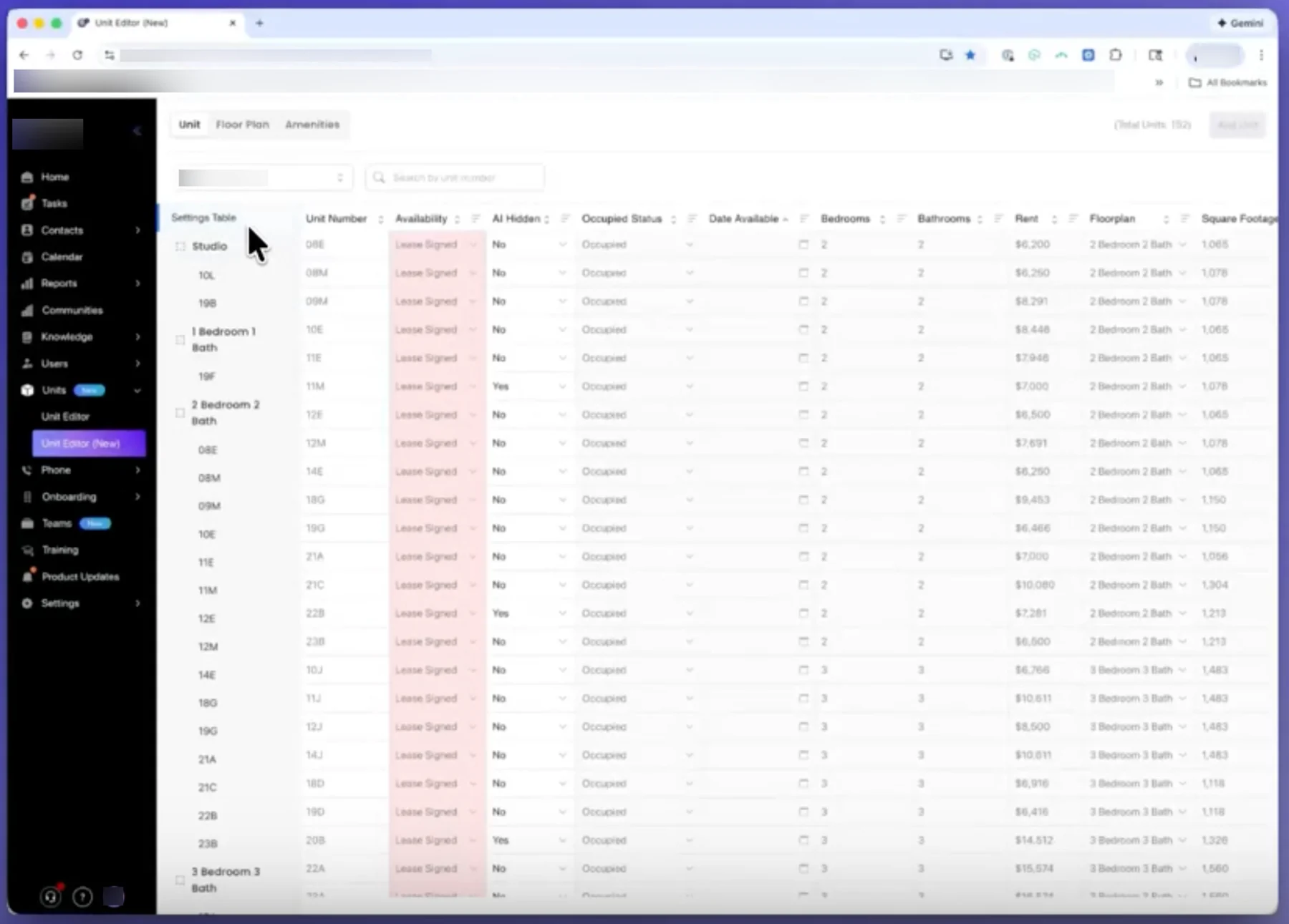
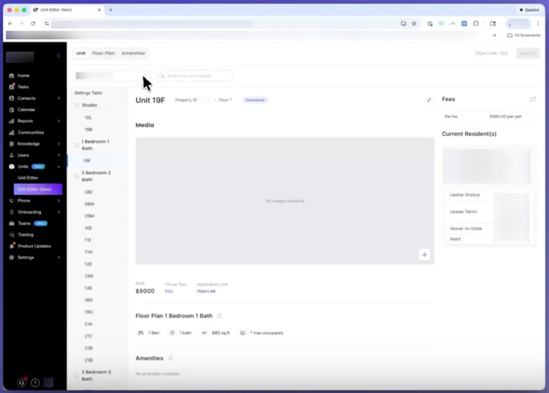
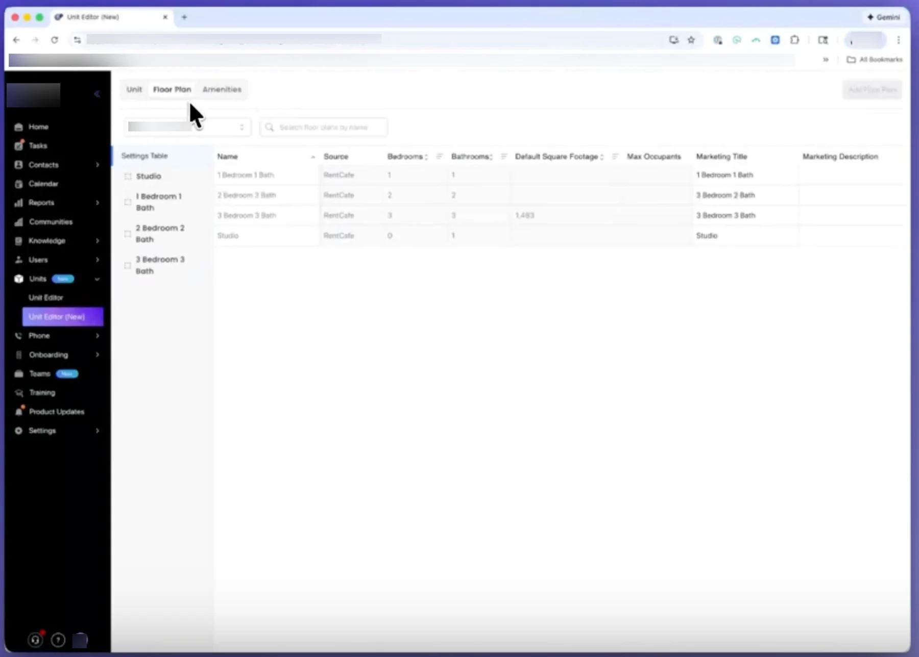
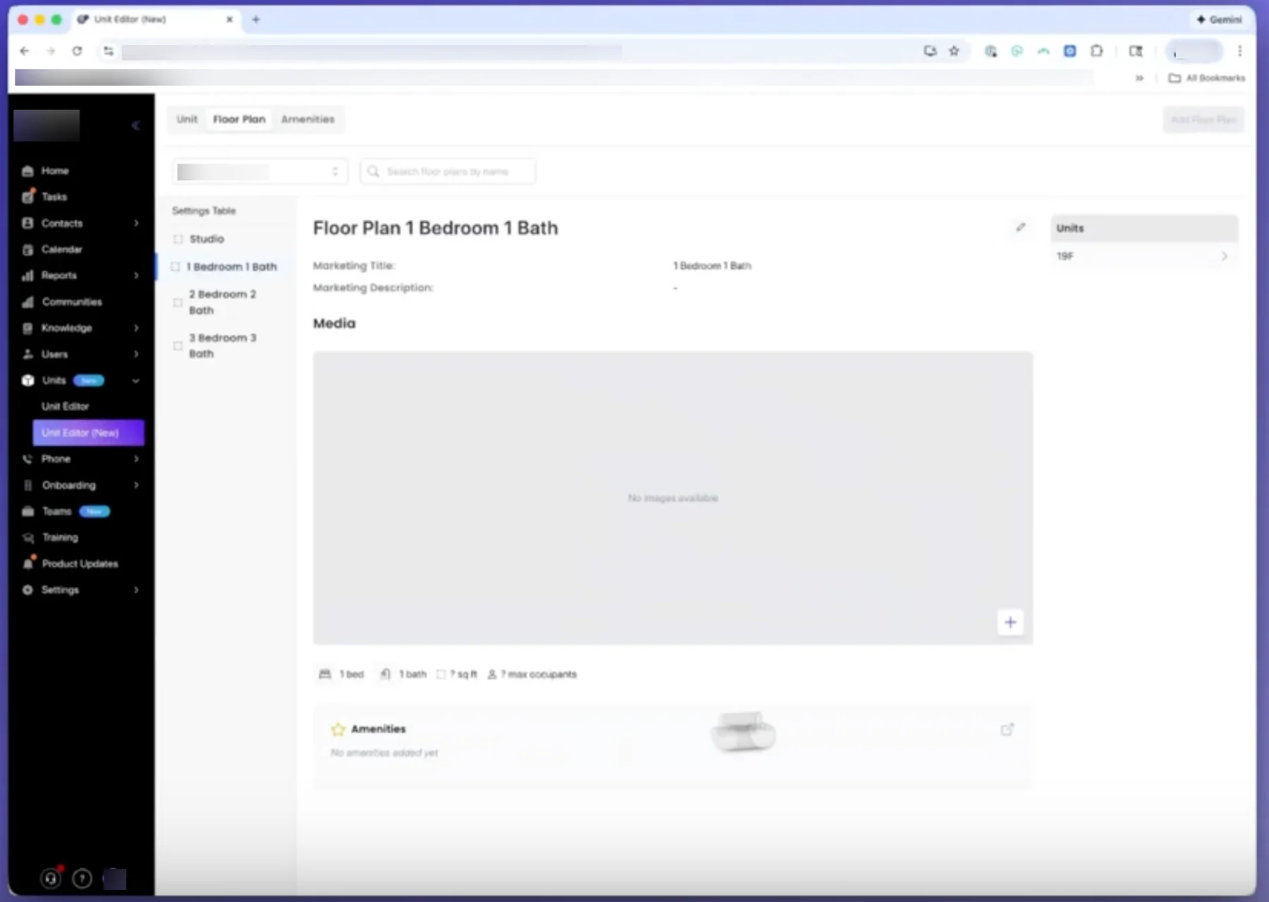
The screens I pulled apart. Each shows the same pattern: entities grouped by the screen they live on, not by how they relate.
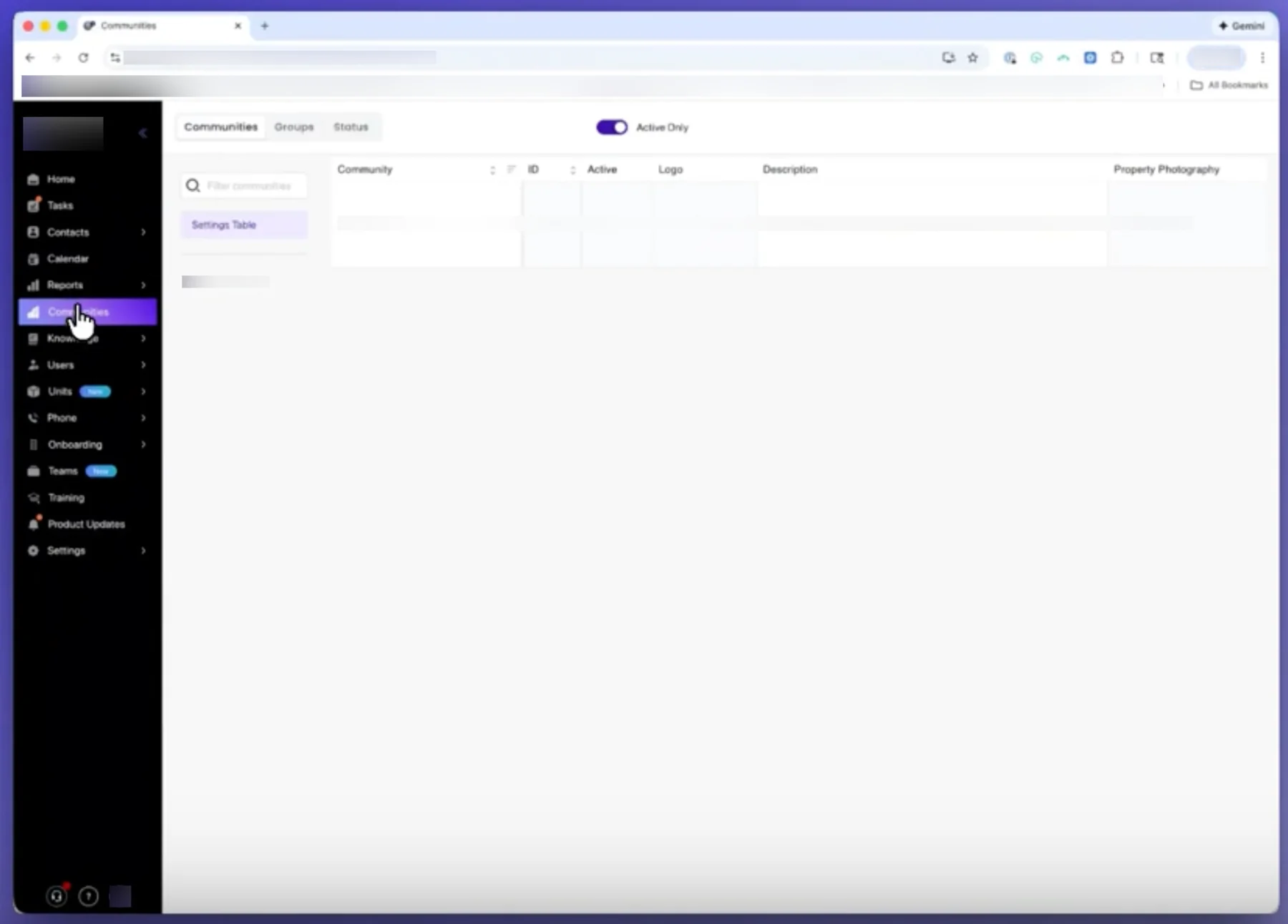
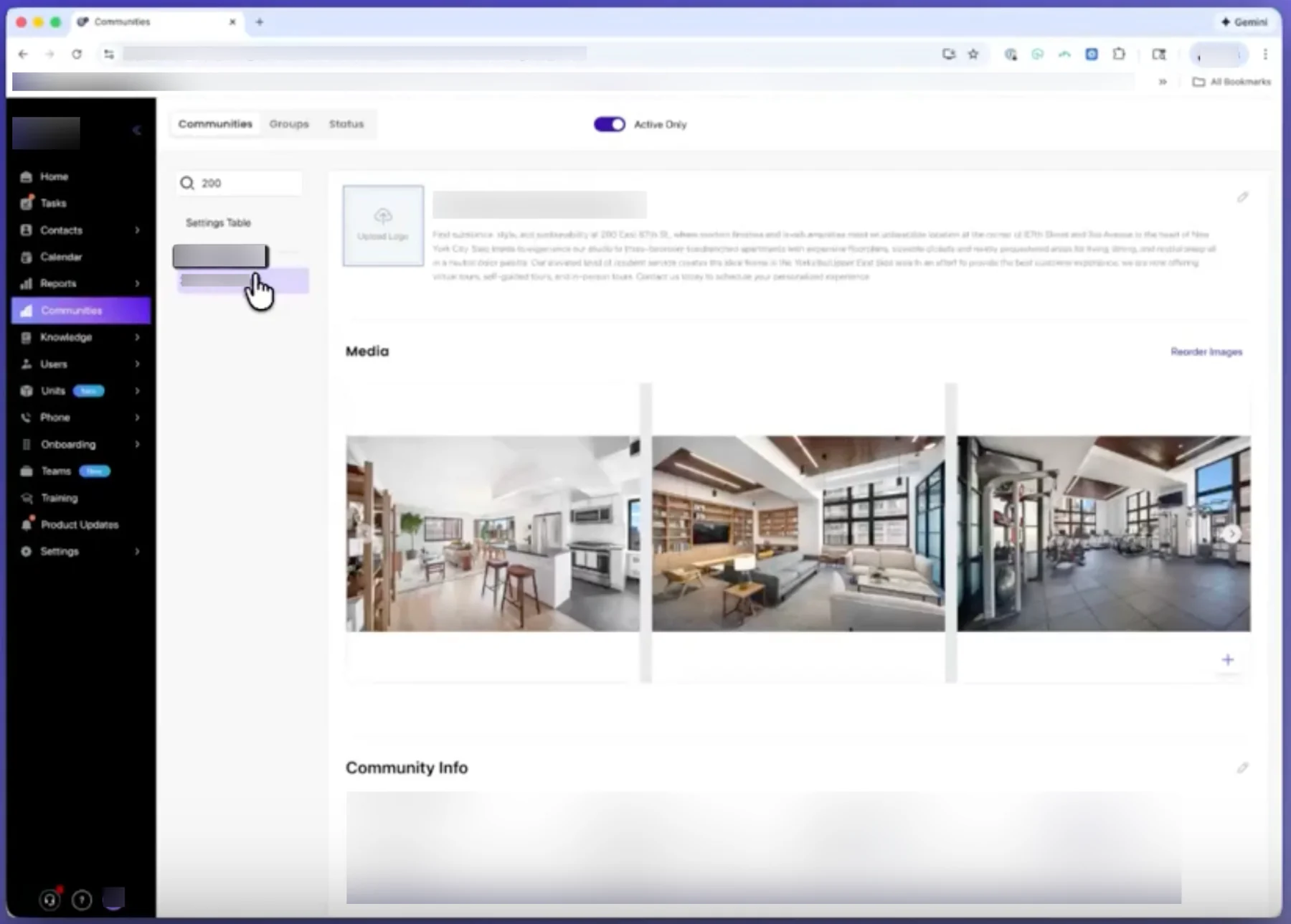
Competitor Communities screen with Communities, Groups, and Status as sibling tabs
01 · Communities, with Groups and Status as sibling tabs
Competitor community detail page with Media bundled inside
02 · A community's detail page
Competitor unit editor with Unit, Floor Plan, and Amenities as peer tabs
03 · Unit editor, Unit / Floor Plan / Amenities as peer tabs
Competitor single unit detail view
04 · A single unit's detail view
Competitor Floor Plan tab listing unit types separately from units
05 · Floor Plan tab, unit types listed apart from their units
Competitor floor plan detail, disconnected from its units
06 · A floor plan's detail
Competitor Amenities tab as its own section
07 · Amenities tab

What I changed

Three moves, one principle. Modelling the IA on real relationships meant connecting some things and separating others.

Communities and units, now linked

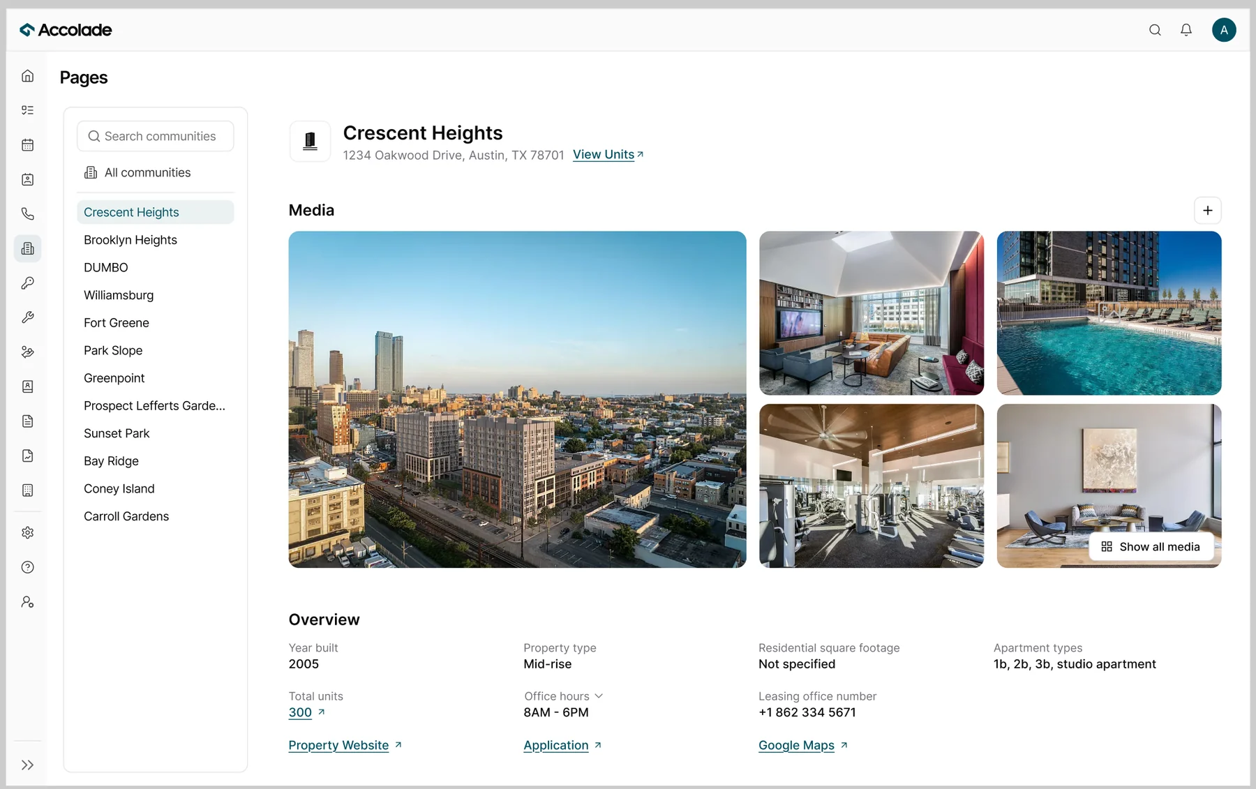
Communities and units. A community page now has a "View units" button that carries you into its units, so the relationship is navigable, not implied.
Competitor community detail page, before
BeforeCommunities and units were standalone sections with no links to one another.
Redesigned community page with a View Units link into its units
AfterA community page carries a "View units" button that drops you into that community's units - filter pre-applied - so the relationship is navigable, not implied.
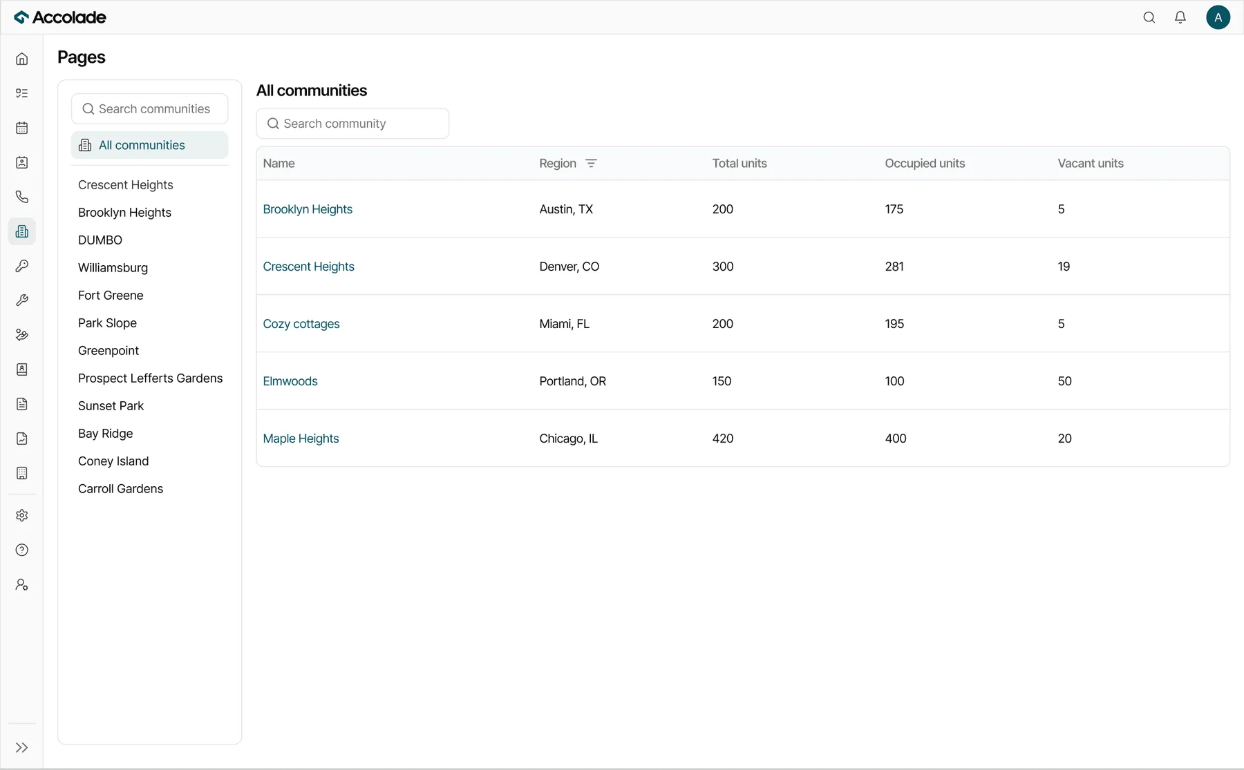
All Communities table with search, region filter, and columns for total, occupied, and vacant units
All Communities table where users can browse, compare, and filter according to their requirements.

Units nested under unit types

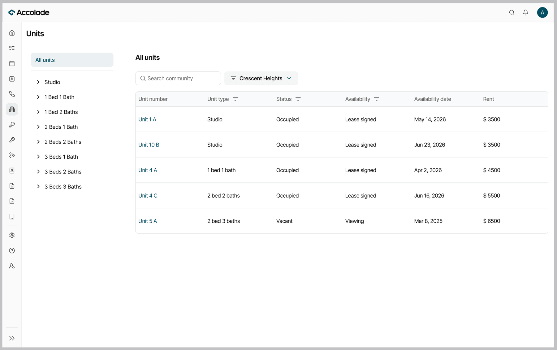
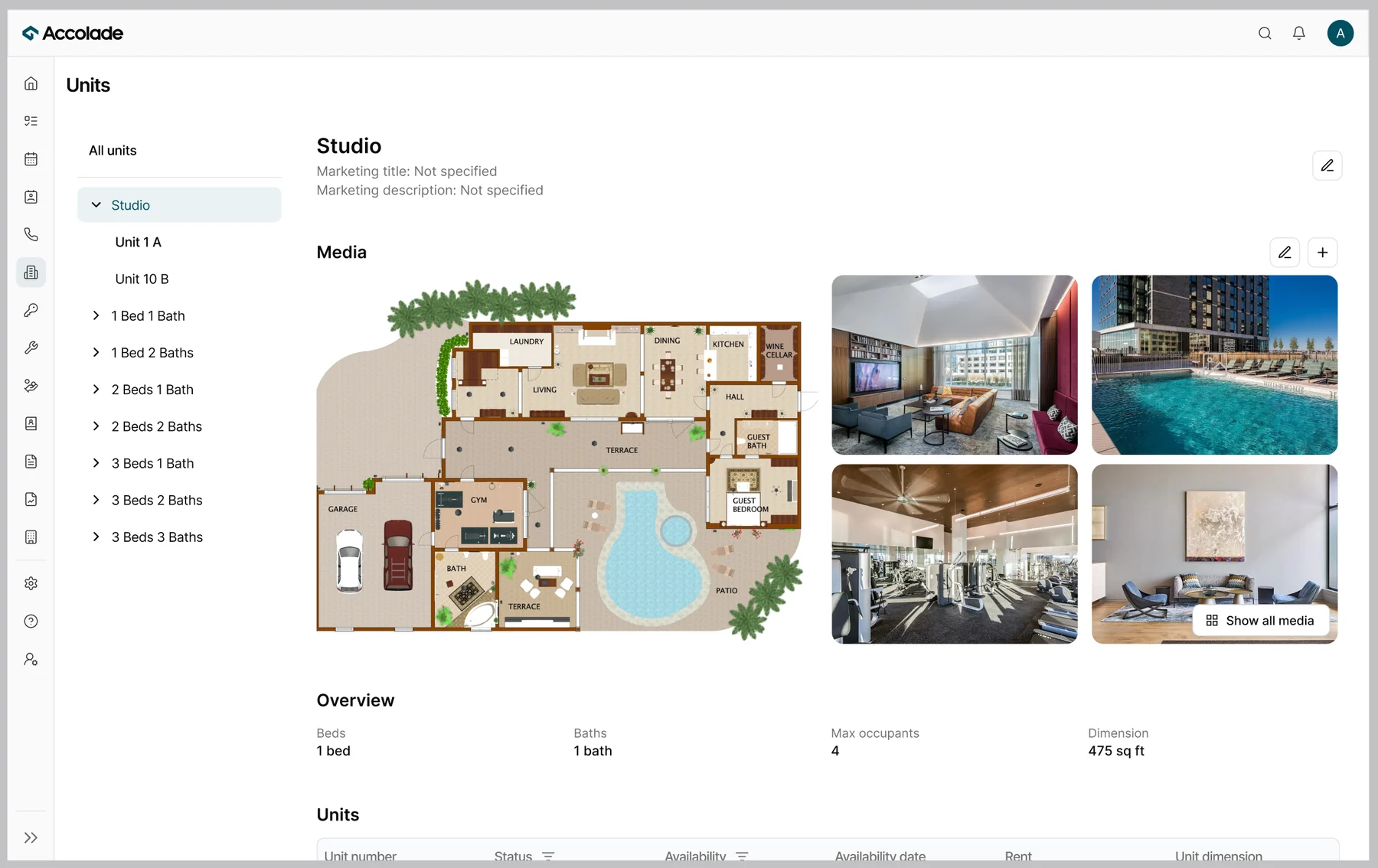
Units under unit types. Unit types expand to reveal their units, so the parent-child hierarchy lives in the structure itself.
Competitor Floor Plan tab, unit types listed apart from units, before
BeforeFloor plans lived in their own tab, listed apart from units.
Redesigned Units, grouped under their unit type, after
AfterAll units, now grouped under their unit type in one place.
Competitor floor plan detail on its own, before
BeforeA floor plan's detail stood on its own.
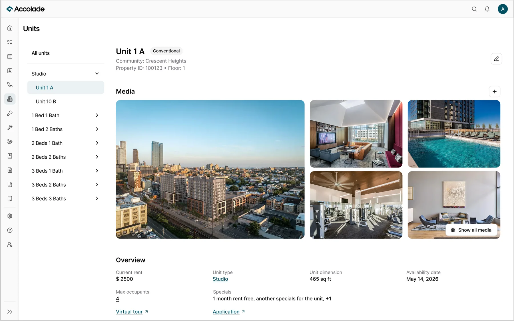
Redesigned unit type detail showing its nested units, after
AfterOpening a unit type reveals its details and the units nested inside it.
Redesigned unit detail page for Unit 1 A, reached from its unit type, with media and overview in one view
A unit's own page, reached through its type and units table.

Community groups, given their own section

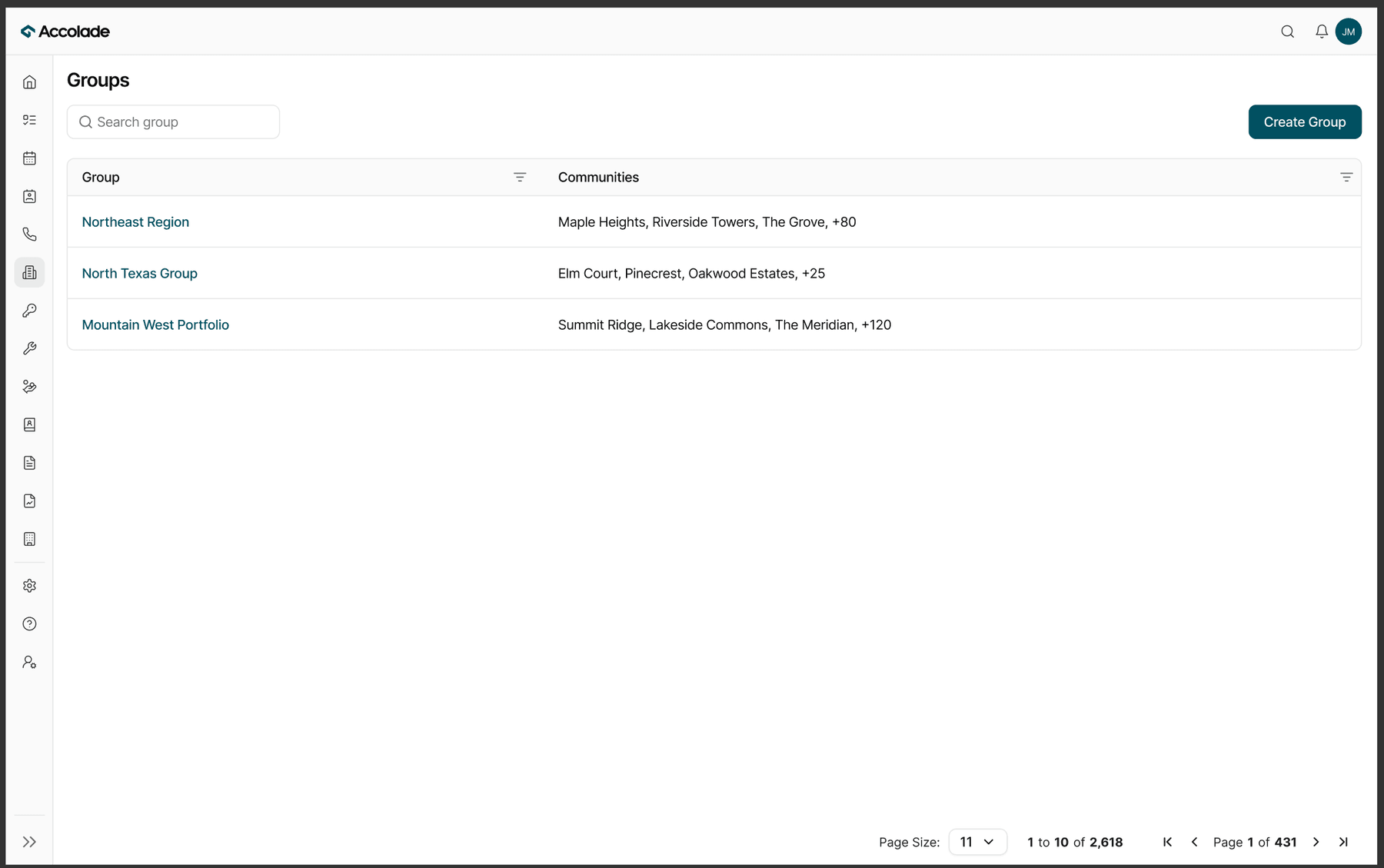
Community groups into their own section. A group spans many communities (a region of 80+ properties), an operational layer, not a sub-tab of one community.
Competitor Communities screen with Groups as a tab, before
BeforeA well-funded competitor: Community groups lived as a tab alongside Communities and Status, bundled under one section, not their own layer.
Redesigned Groups as its own standalone section, after
AfterGroups got its own standalone section, since a group is a collection of communities, not a sister entity.

Connecting two things and splitting a third under the same principle is the proof that it's a principle, model the IA on how the entities actually relate, not a bias toward merging or splitting.
The messy middle: how I actually got there

Neither the structure nor the page came out right on the first pass. The clean version above is where it landed; this is the mess it came out of.

01 · The structure

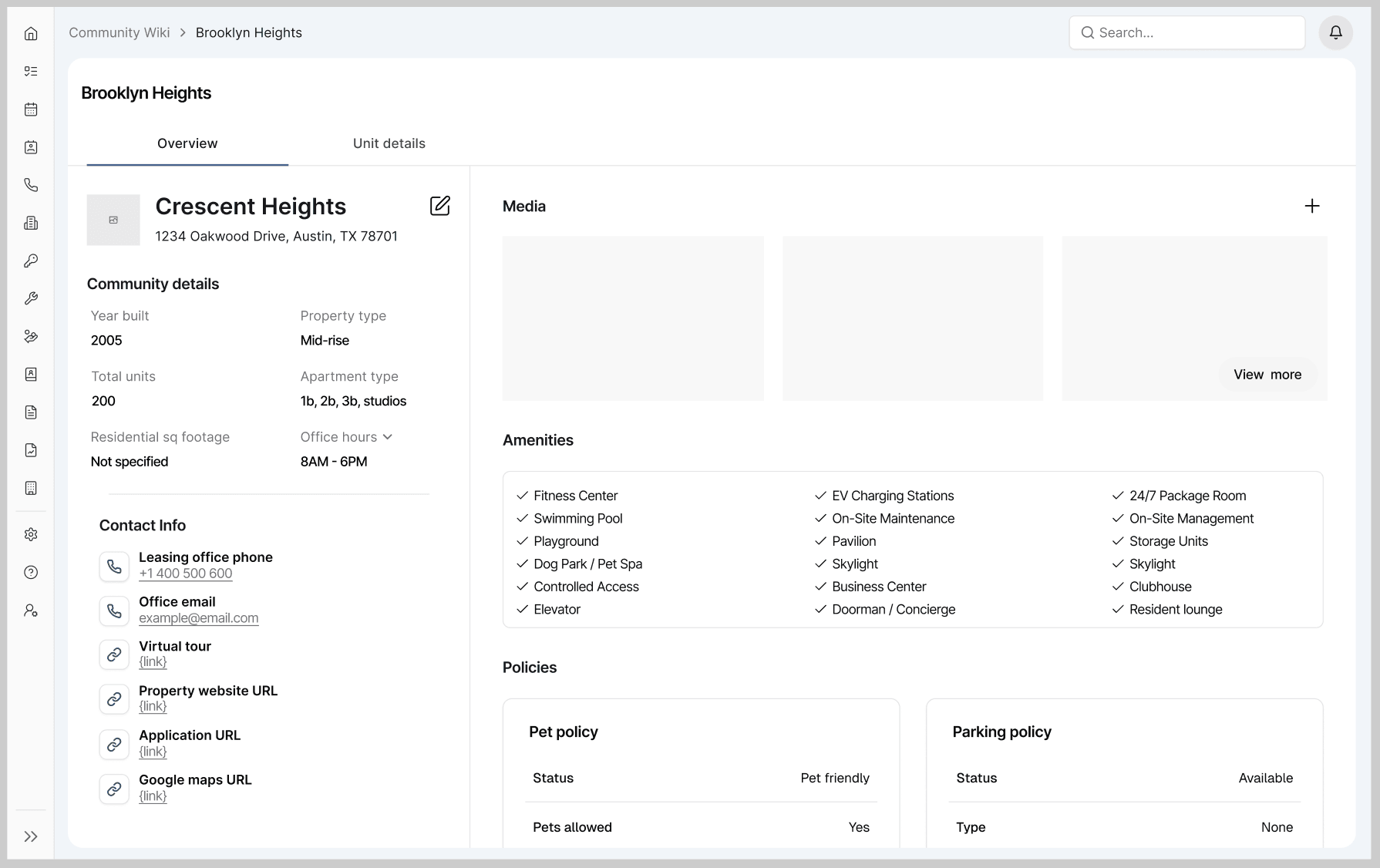
I didn't copy the competitor's IA. The first thing I noticed was that they kept communities and units as two separate, unconnected sections, even though a unit is part of a community. So I tried to connect them, and my first pass made units a tab inside the community.

That broke. Two sibling tabs say these are equals, but a unit is a child of a community, not a peer, and the tab had nowhere for unit types, the parent layer that groups many units, so it collapsed into a column.

Getting it wrong twice, their separation, then my tab, is what produced the three moves above. The tab version is the "before" in the Link and Nest receipts above.

My first pass: units made a tab inside the community page, Overview and Unit details as sibling tabs, with nowhere for unit types to live
My first pass: units as a tab inside the community, no room for unit types.

02 · The page

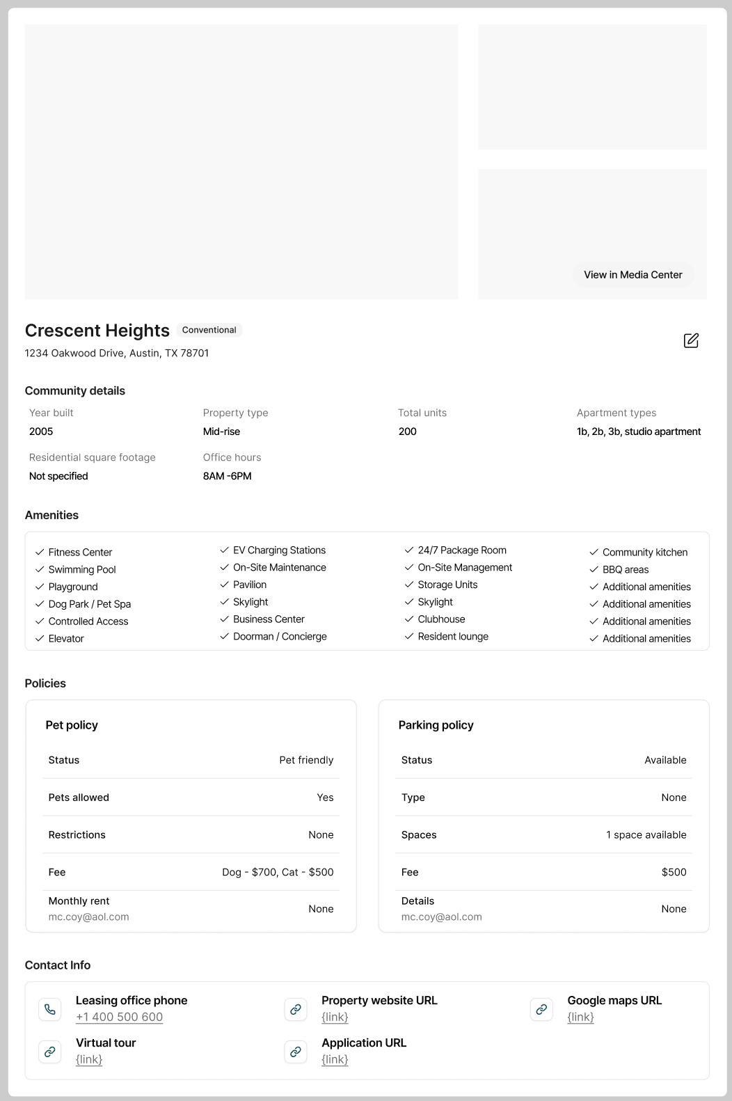
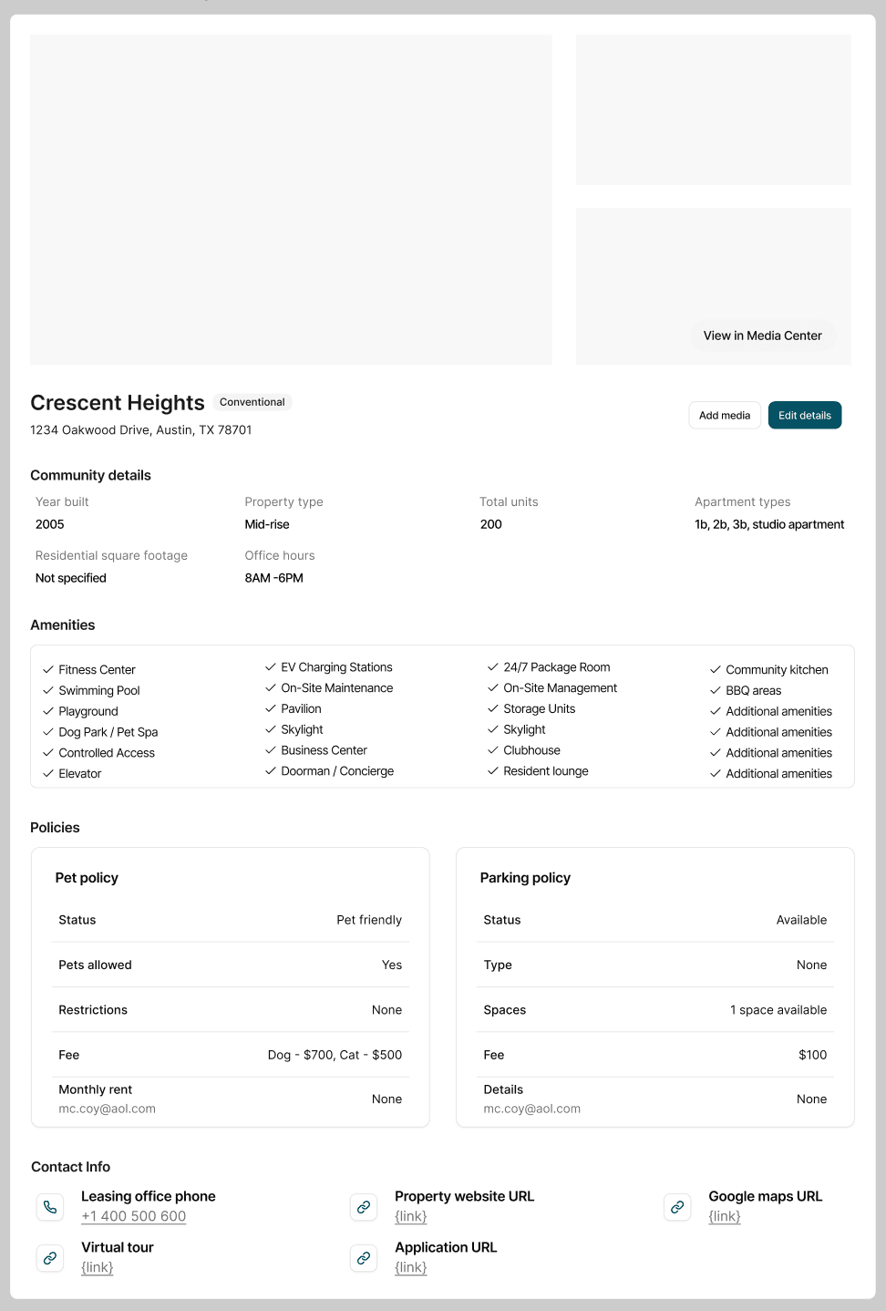
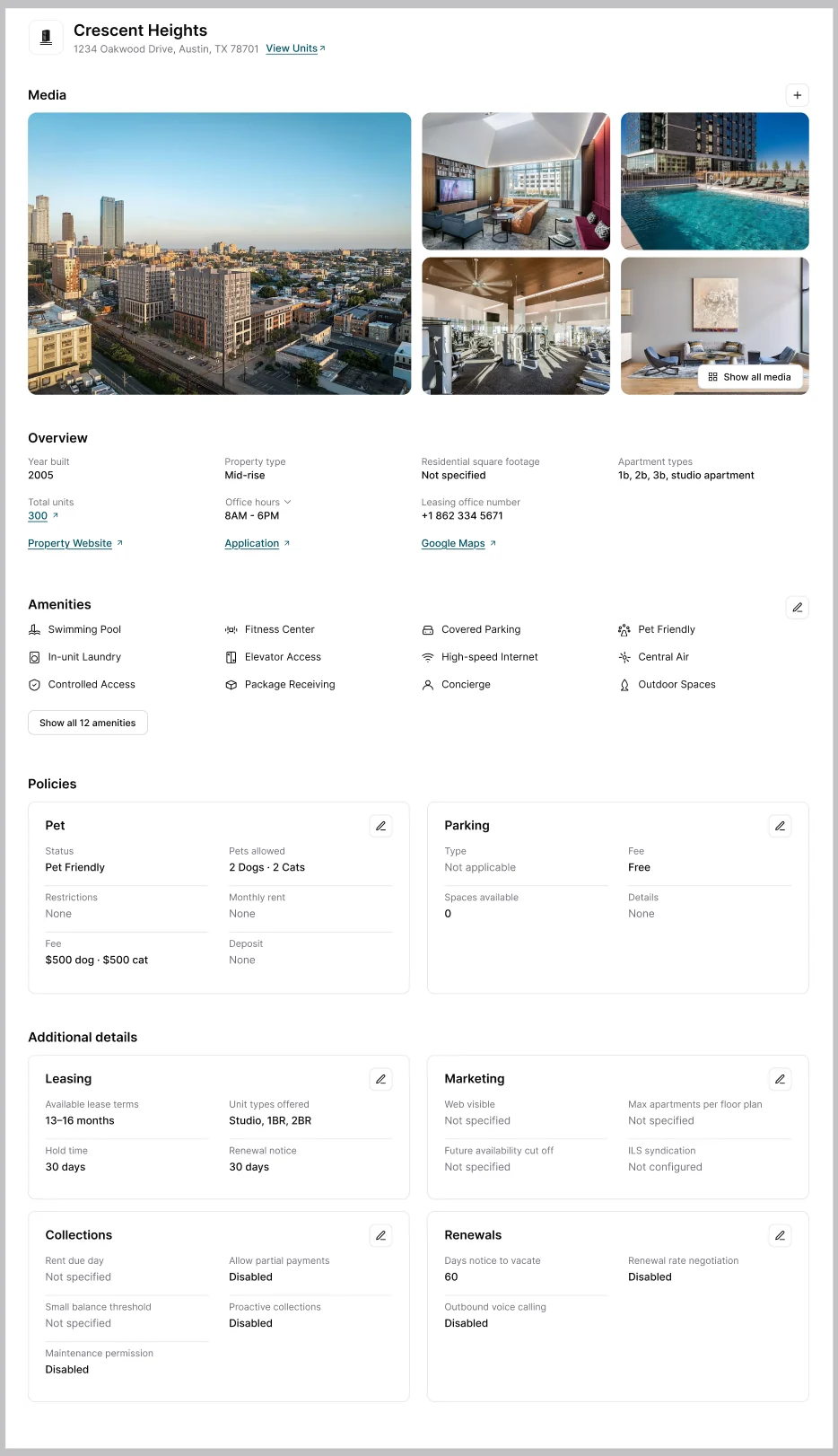
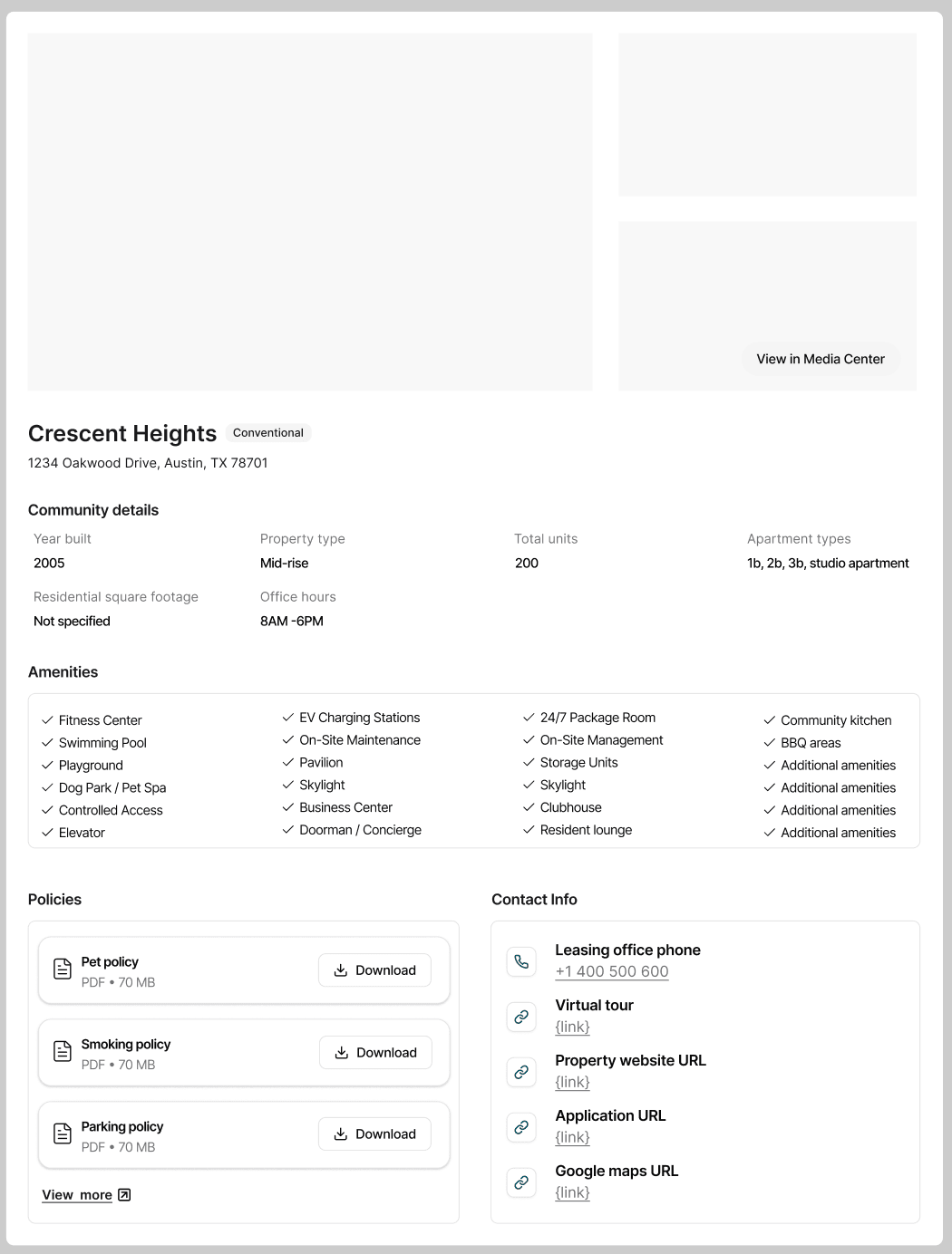
The three moves fixed how the entities relate across the product; the community's own page still had to be designed, and the early versions show the wrong instinct before the right one. They were organized around the data: a flat grid of facts, amenities dumped as one checklist, policies buried in a 70 MB PDF. I made the cosmetic fixes first, structured the policy fields, cleaned up the edit controls, and it still felt wrong, because the problem wasn't cosmetic.

So I asked the same question one altitude down: why does a leasing agent open this page, and what do they need the second they land? Two decisions came out of it I'd defend in any room.

Early iteration of the community page, a flat grid of fields organized around the data
Second iteration with the fields structured into cleaner groups
Third iteration adding edit controls
Final community page grouped by the agent job, with real media and per-section edit controls
Iteration 01

Organized around the data, not the job.

  • Grouped by the job, not the database

    The operational settings became four sections, Leasing, Marketing, Collections, Renewals, because that's how leasing teams already split the work in their heads. I wasn't inventing a taxonomy; I was naming one that already existed in the domain.

  • Designed for the moment the data is wrong

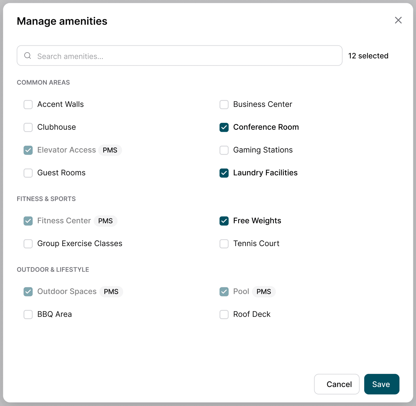
    The page was built read-only, everything synced from the PMS. I asked the unglamorous question: what happens when the PMS is stale and the agent has the truth in front of them? So I split the data by provenance: PMS-synced fields stay locked, but anything the agent needs to keep current, they edit here, which is why every section carries its own edit control. Designing for the failed sync is what made the page trustworthy to the agents it was built for.

    The Manage amenities editor: PMS-synced amenities carry a PMS badge and stay locked, while everything else is a live checkbox the agent can edit here
    Split by provenance: PMS-synced fields stay locked, everything else stays editable in place.

Outcome

I defended this to leadership, who'd wanted the competitor mirror, and that question held: there was no use case for their grouping. It was built through development, but isn't live yet. The company paused operations during a funding round, so testing is incomplete.

Of the eight features I owned end to end, six reached development and two were shelved for scope. I speak to what I designed and defended, not usage numbers I can't yet claim.

What I carry forward

In a "copy the funded competitor" culture, use-case-first pushback beats opinion or credential. When the real reason is "they got funding," there's no answer to "what's this for?"

"What is this copy for?" became "What is this feature for?" Same instinct, bigger canvas.