Google Pay: Whoever scans, pays
One in five Indian families with a UPI user has been defrauded. A fifth of them scanned a QR code that took money instead of sending it. The direction is never in doubt on the screen where that happens. It is just one word on it.
What this is
An independent teardown. Self-directed and unpaid. Payments, india.
Tested on
Google Pay 0.346, iOS 26.6 · 24–27 August 2026. Paytm 10.83.10 is quoted once, in section 3
Method
Both flows walked by hand, with real money and a consenting third party's UPI ID
Independent. Not affiliated with, commissioned by or reviewed by Google, Paytm or NPCI. Screens are native captures except the UPI PIN screen, which is NPCI's Common Library and sets the secure flag. Every screen and every design here is Google Pay. Paytm is quoted, not shown.
Someone you do not know sends you a QR code or a payment link with a story attached: a refund, a deposit, the buyer for the sofa you listed. You are told to scan it to receive the money. You do. The amount is either already in the field or you type the one you were promised. You enter your PIN, and the money leaves your account.
There is no QR code that receives money. There is no payment link that receives money. Scanning is always paying. The screen that opens does say so, in exactly one word: "Paying", in front of the name.
Google Pay is not silent about this. A line on the UPI PIN screen tells you never to enter a UPI PIN to receive money. People lose money this way anyway.
This is a teardown of that screen, and of three ways the direction could be put back on it.
I counted every tappable target on the home screen by hand before writing any of this, to check whether the problem below was a symptom of a busy screen. It is not. The problem is not how much is on the screen.
What Google Pay was built against
Google Pay arrived in September 2017 as Tez, and the thing it had to beat was not a competitor. It was cash, which needs no signup, no battery, no network and no instructions. The clearest result is that it read your address book instead of asking you to build a beneficiary list, which is what sending money through a bank meant then: a name, an account number, an IFSC code, registered before the first transfer would clear.
1. What the screen spends its size on
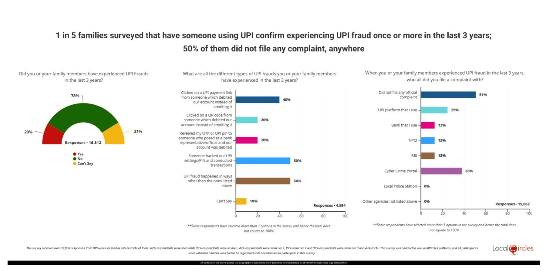
The QR code scam happens often enough that somebody has measured it. A LocalCircles survey run across 365 districts between March and June 2025 found that one in five families with a UPI user had been defrauded, from 16,312 responses. Among the 4,894 who said they had been defrauded, 20% said a QR code had debited their account instead of crediting it and 40% said the same of a payment link. Respondents could pick several answers, so the two overlap.
Two answers rank higher, both at 50%: settings or PIN compromised, and a plain "other". And the survey ran four months before NPCI abolished the flow that most plausibly accounts for part of that 40%. (See section 4.)
The survey records the QR and the link as two answers. They are one mechanism, arriving through two doors.
A UPI QR code and a UPI payment link are not similar mechanisms. They are the same instruction.

The example URL printed under "Hyperlink" in clause 2.1. The identical 299 characters appear under "QR Code" in clause 2.2.

The same instruction as a picture. One corner is covered on purpose: a scanner finds a code by its three corner squares, and this one encodes a real payment. NPCI UPI Linking Specifications 1.6, November 2017. NPCI does not publish this document publicly, so this is from a mirrored copy.
There is no receive anywhere in the upi://pay URI. The payee address is mandatory; there is no payer parameter and no field that sets a direction. The only direction in the instruction is the verb in its name. Whoever scans, pays.
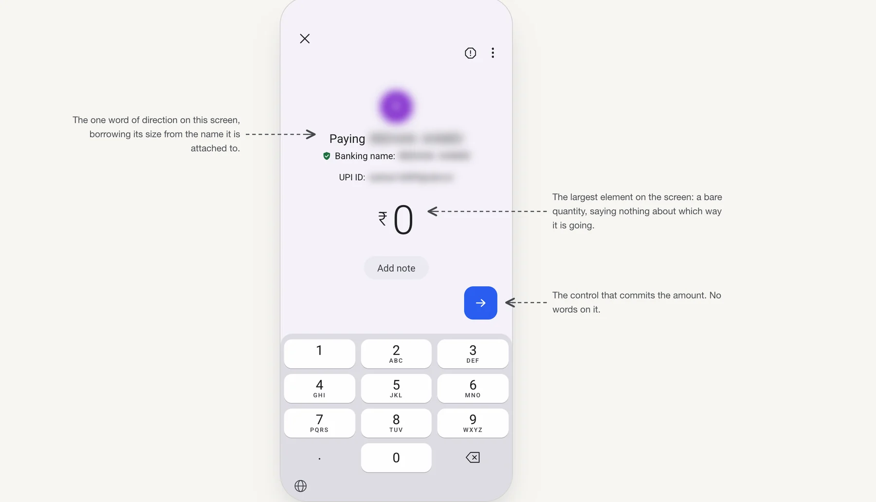
Scanning a person's code takes two steps, and the first is where the amount is typed. The biggest thing on it is the amount, at roughly three times the size of anything else, and it is a bare quantity. Direction gets one word: "Paying", in front of the name, borrowing its size from the name it is attached to. The control that commits the amount is an arrow with nothing written on it.
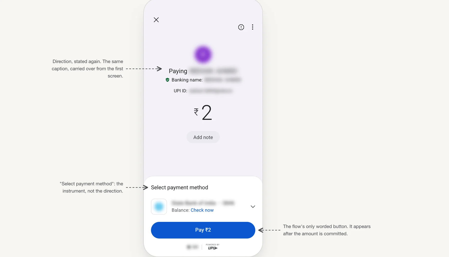
The word "Pay" does exist in this flow. It arrives in the second step, on a panel that slides up over the keypad once the amount is entered, inside the button carrying the figure. The heading above the account on that panel reads "Select payment method": the instrument, not the direction. Scanning a merchant's code, the app puts all of this on one screen. Scanning a person's, the one worded button is held back until the amount is already committed.
A scammer's name is real and their bank is real. Since April 2025 that name is pulled from bank records, so it is verified as well. Everything the screen shows you in large type can be true and still not protect you. The one thing that cannot be faked, that this is money going out, gets a single word while the amount is being typed.
Google's fraud systems cannot reach this. They look for an outsider: another person on the call, another app on the phone, a payment that does not fit the pattern. The version that arrives as a WhatsApp message about a marketplace listing has none of those. The code is validly formed, the account often belongs to a real person, the amount is unremarkable, the PIN is correct. On every signal collected the transaction is normal, because it is normal. A model can find a strange payment. It cannot see a belief.
2. The ₹2,000 ceiling, and what it admits
Try to pay more than ₹2,000 from a QR code saved in your gallery and Google Pay stops you, with an inline error on the amount screen, in red:
"For amounts over ₹2000, scan QR instead of uploading"
It appears and it disappears. It does not say whose rule it is. And it names a way around itself.
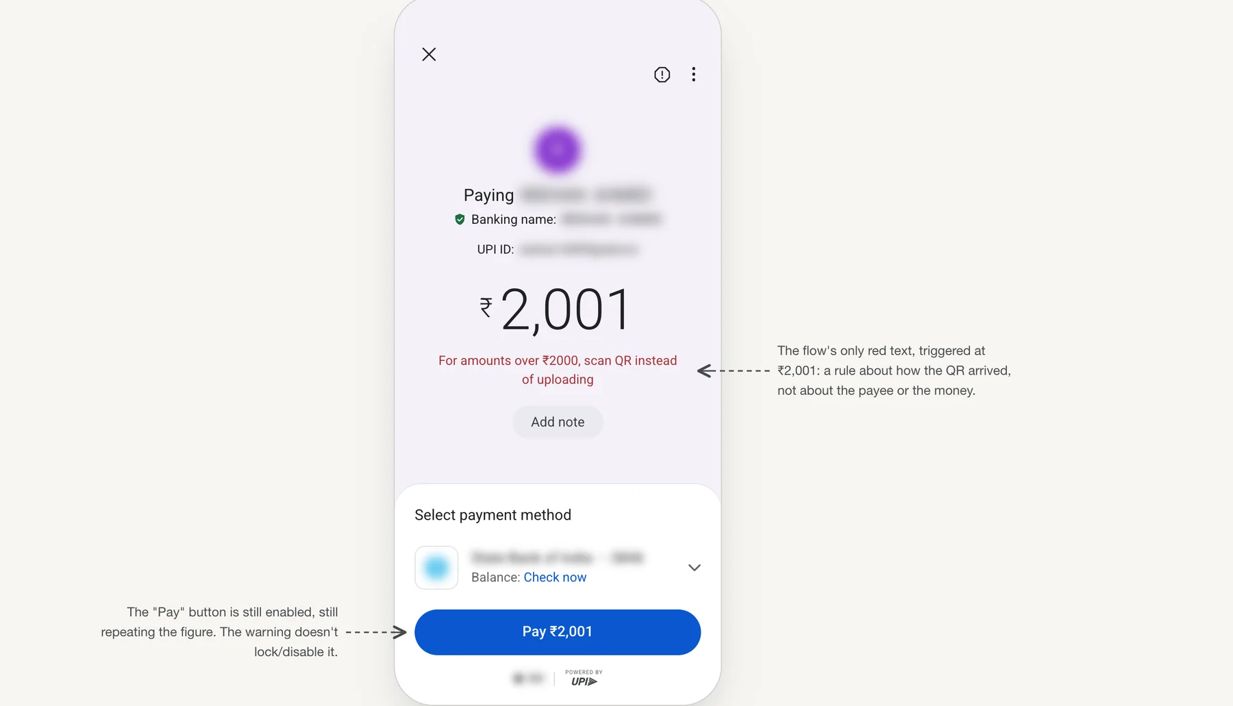
In one test, on one device, on 24 August 2026: the same code and the same payee, refused above the ceiling through the gallery picker, went through when the app's own camera was used instead. The limit checks how you opened the code, not who sent it. You can change how you open it. You cannot change who sent it.
The rule behind it has a name worth reading. NPCI's circular of 8 April 2025 caps "QR Share & Pay" at ₹2,000, meaning a QR that arrives as an image rather than one scanned live. The name says share. The definition says image. Those are the same thing right up until someone opens the image on a second screen, and then the code is still shared and the cap is gone.
A cap is an admission. It prices the misunderstanding instead of correcting it.
3. The sentence is in the product. It arrives last.
Google Pay does say it, and so does every other UPI app, because the screen it is printed on is the same one. On the UPI PIN screen, directly above the keypad:
"Never enter a UPI PIN to receive money"
Read where that lands. The PIN screen is the last screen: the code scanned, the payee accepted, the amount typed or already filled, the thumb on the keypad. It is correct, and delivered after the moment it corrects.
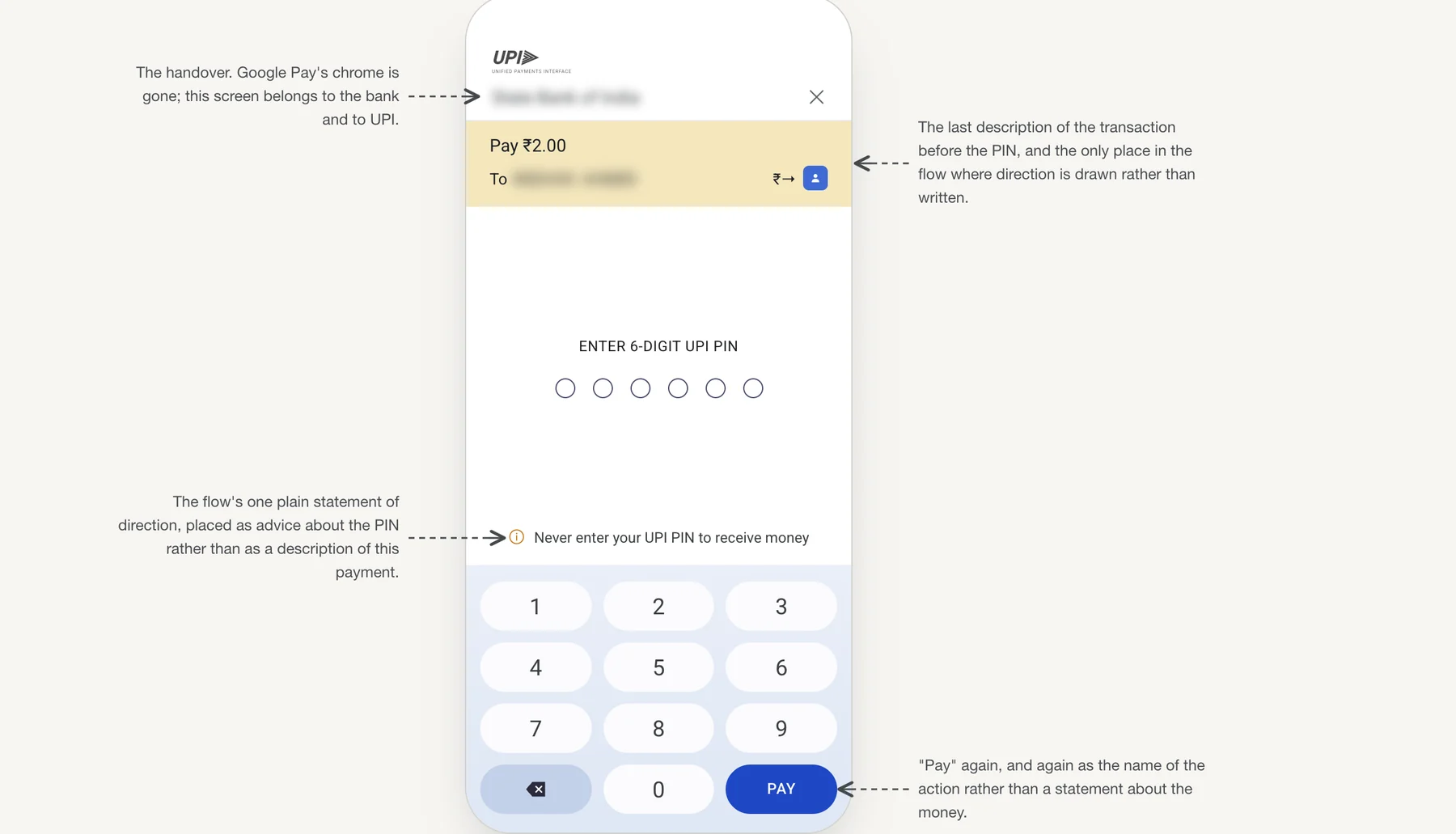
That screen is NPCI's Common Library, a component every UPI app embeds so that no app ever sees your PIN. Which produces an odd result. The only place in the flow where direction is stated plainly is the one screen competition cannot touch, and it is the last one you see.
The same rule produced different words elsewhere. Paytm, on the same ₹2,000 ceiling, writes: "You can pay up to ₹2,000 for QR selected from your photo gallery as per UPI guidelines. Please enter a lower amount to proceed." Same constraint, same moment, a different string. That is the only thing I want from the comparison: the wording was a choice, not something the rule handed down.
4. What the regulator did instead
There was a second flow with the same confusion in it, and it is gone. A UPI collect request let one person ask another for money: a screen arrives unprompted, asks for a PIN, and entering the PIN sends money away. NPCI discontinued person-to-person collect requests from 1 October 2025.
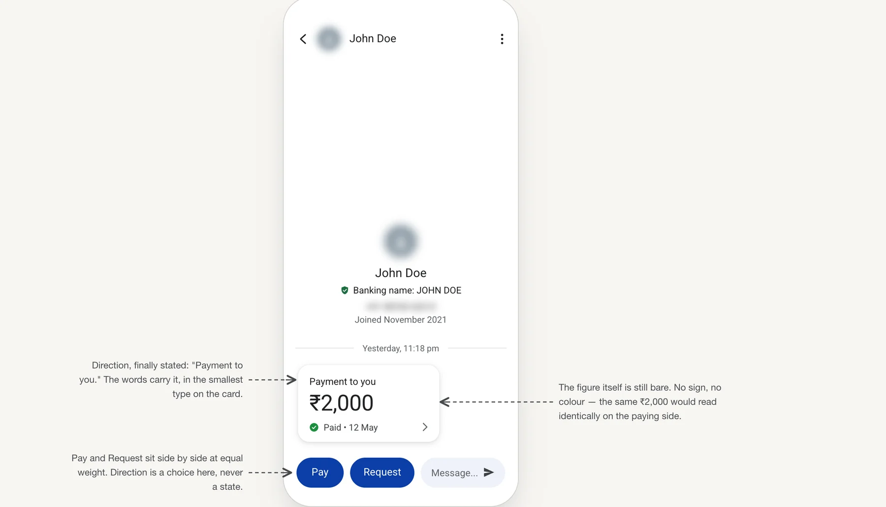
So the regulator's answer to a direction problem was to delete the flow, not to redesign the screen. Scanning cannot be deleted: merchant payments are now the majority of UPI, 12.71 billion of 20.01 billion transactions in August 2025.
5. Three ways to put direction on the screen
After the scan and before the PIN: the screen where the amount is typed, and the panel where the payment is committed. Three places the same fact could live.
Option 1. Draw it: an arrow, with the payer named
Put the payer and the payee side by side at the top with an arrow between them. Direction you see rather than read, before any words. Google Pay has drawn this before: on an older checkout panel, a circle with my initial sat beside a circle with the payee's, a chevron between them. It is not there now. What survived is one circle, for the payee.
I would not restore it as it stood, because it was ambiguous. Two initials and a chevron, with nothing to say which circle is you, and this is a scam that works by fitting evidence to a belief. So name the payer end.
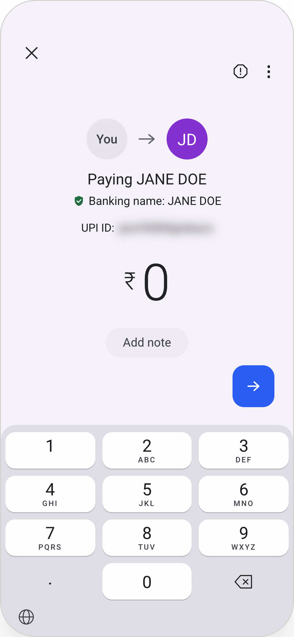
This is the one I would recommend, and the reason is reach. UPI was built so that somebody who reads poorly can still take part: a code, a phone number, no forms. But every indication of direction on the payment screen is text, and text is the one thing this literature is clear about: it fails first-time low-literacy users outright (Medhi Thies et al., ACM Transactions on Computer-Human Interaction, 2011). An arrow is the only option here that reaches somebody who cannot read the sentence at all. The same work is a warning about the fix, because abstract symbols are read unreliably too. That is why the arrow alone is not the proposal, and why the payer end is named.
Trade-off. Reaches the reader who cannot read at all. Costs vertical space at the top, sits away from the amount where the eyes actually go, and still asks for a symbol to be interpreted.
Option 2. Say it: name the account the money leaves
The account is the only thing in this flow that is directional and not a person. It lives on the panel that slides up over the keypad once the amount is entered, so the line goes there too. Bind it to the picker: change the account and the line changes with it.
That is late. The panel opens only after the amount is committed. But it is the last surface before the PIN, and it sits beside the one button in the flow that has a word on it. "Paying" can be read as the screen's title. A sentence cannot.
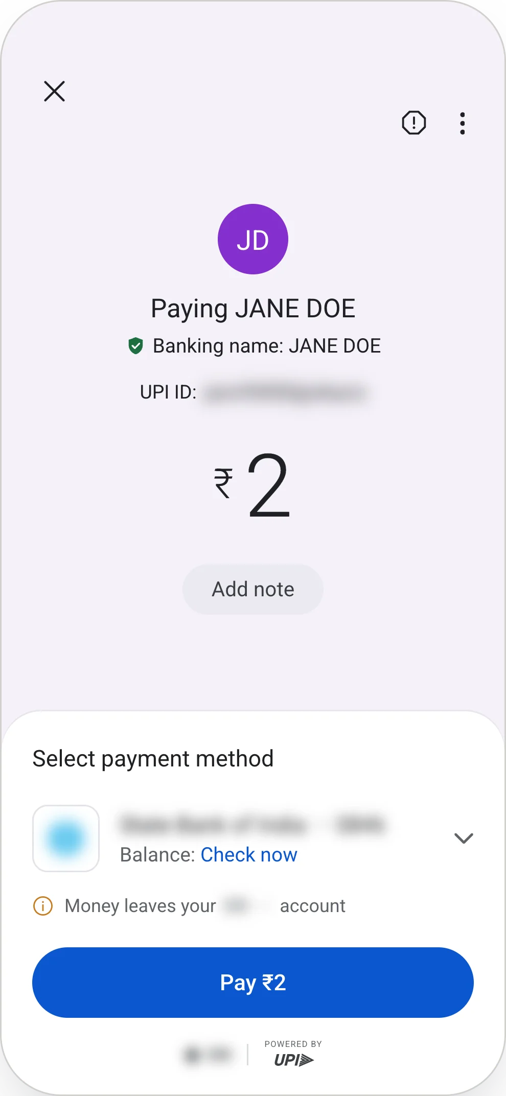
It has to be true on every payment route. Mostly that is a change of noun, and the table below carries the line for each.
| What is paying | The line |
|---|---|
| A bank account | Money leaves your SBI ••••2449 account |
| UPI Lite | Money leaves your Lite balance on this phone |
| UPI Circle, paying from somebody else's account | Money leaves Anita's SBI ••••2449 account |
| A mandate, or funds blocked for an IPO | ₹3,000 is blocked in your SBI ••••2449 account |
| A RuPay credit card on UPI | Your RuPay card is charged |
The last row is the one that breaks the pattern. Nothing leaves a credit line, so "leaving" is the wrong verb and the sentence has to change rather than the noun.
Trade-off. The only option that says it in words, and the only one whose wording changes with what is paying. It is also the last to arrive, on a panel the reader reaches only after committing the amount.
Option 3. Sign it: the minus on the amount
Direction goes where the eyes already are. The amount is the one element that says nothing about which way it is going. Typed, the sign arrives with the first digit. Pre-filled from a code, it is already there.
Google Pay already signs amounts, just not here and not both ways. In transaction history, money arriving carries a plus and money leaving carries nothing at all. Paytm signs both. The convention is not foreign to the product or to the market, and Google Pay has kept the half that is good news. So Option 3 asks for two things. Mark money leaving as well as money arriving. And show the mark while the payment is being made, not only in the history afterwards.
The sign is still new at this point in the flow, so the first time it appears it needs a legend: Money will leave your account, set beneath the amount. The sentence teaches the sign, and the sign is what survives once nobody reads the sentence.
Trade-off. Puts direction where the eyes already are, on the largest element on the screen. It is the most ambitious of the three, it touches every amount in the app, and it is untested. What I would expect to go wrong:
- A leading minus reads as a refund, a decline, or an error.
- The minus would sit in a field the user can edit. Backspace to fix the amount and the sign goes too, unless it is drawn as part of the field rather than as a character in it.
- Every other place an amount is rendered would have to agree, or the app contradicts itself.
- Some UPI screens show an amount that is not going anywhere yet. An autopay mandate agrees to a payment later; a block holds money aside for an IPO or a trade without taking it. A minus on those would say the money had left when it has not.
It is a change that has to clear an experiment before it touches every payment in the country, and the metric it would be judged on is payment success rate, not comprehension.
What I would ship first
Three redesigns, and the one I would ship first is none of them. Every option above changes a screen that every UPI payment in the country passes through, so each one means an experiment and a long argument about conversion before a single user sees it. The cheapest change in this piece is to a string that already exists.
The ₹2,000 message in section 2 fires rarely, on one condition, on a screen no conversion target depends on, and it is the only place in either app where a refusal could explain itself. One clause:
Proposed
"UPI limits payments from a shared QR code to ₹2,000. If someone sent you this code, check what you are paying for before you continue."
It does not tell the user why NPCI wrote the rule, because I do not know why NPCI wrote the rule and no compliance team would sign off on a string that speaks for a regulator. It states the limit and names the risk.
6. This is untested, and here is what it rests on
Nothing here has been tested. No comprehension study, no A/B, no users. What follows is a design argument built on the measurements above, and it should be read as that rather than as a finding.
The numbers, honestly. UPI fraud reported to Parliament: ₹242 crore in FY22, ₹573 crore in FY23, ₹1,087 crore in FY24, ₹981 crore in FY25, and ₹805 crore across the first eight months of FY26. That last figure covers eight months, not twelve, so the FY25 dip may not be a dip: at the same rate the year lands near ₹1,200 crore, above both FY24 and FY25. Transaction volume grew faster still, so the fraud rate can be falling while the total climbs.
Where the principles fight each other. Attention to a repeated warning drops sharply within the first few exposures (Vance et al., MIS Quarterly, 2018), and the proposed remedy is varying how it looks. All three options do the opposite.
The strongest argument against all of this is in section 4: the regulator deleted the flow rather than redesign the screen. The second is that Never enter a UPI PIN to receive money already sits on every UPI payment screen in India at the moment the money moves, and the fraud continues. Section 3 blames the timing.
A rival explanation. Perhaps the warning is read, understood, and folded into the story the victim was told: the screen says paying, and they think yes, that is the step that releases my money. Then none of the three works, because a word that gets explained away is not fixed by arriving earlier or set larger.
The test that would settle it. Prime people with the scam, show them the screen, and ask what happens when they enter their PIN: current screen against each redesign, separate groups. If people on the current screen say they know it is a payment and would go ahead anyway, the belief was never the problem and I would drop all three.
Resources
Everything not listed here is first-party observation, dated where it appears in the text.