Google Pay and Paytm: The preference I couldn't explain
I open Google Pay for every payment and had never asked why. So I analysed it against Paytm, tap by tap, expecting the two apps to work differently. Mostly they don't.
What this is
Research behind the Google Pay teardown. Self-directed and unpaid. Payments, india.
Analysed
Google Pay 0.346 and Paytm 10.83.10, iOS 26.6 · 24 August 2026
Method
One device, one sitting. Every number counted by hand
Independent. Not affiliated with, commissioned by or reviewed by either company.
There are three payment apps on my phone, and every time I have to pay somebody I reach for the same one: Google Pay.
Preferences about interfaces are usually about habit. You learn one app, everything else feels wrong, and you call that design. I wanted to know which one this was, so I went looking for somewhere the preference showed up in a number, and for anything suggesting other people had it too.
I analysed Google Pay against Paytm. It does the same job and it is on the same phone.
What I thought I would find
There were two explanations available to me, and only one of them is about design.
1
Google Pay takes less work.
Fewer taps, done sooner. This was the one I believed, and its virtue is that it is easy to kill: count the taps in both apps, and either the numbers differ or they do not.
2
Google Pay asks less of me before I start.
Not less work, less looking. There is no clean way to measure that, so I counted the nearest thing to it: how much is on the screen the moment the app opens.
What I counted, and what I left out
The flows
Google Pay and Paytm on the same phone, in one sitting. Every way you can pay a person, walked from tapping the app icon to reaching the PIN pad, every tap counted one at a time. Keystrokes stay out of the totals, because the amount is the same number of digits in either app and counting them would only have measured the amount.
The home screen
A target is anything on that screen that responds to a tap, scrolled top to bottom.
What I left out
Google Pay has two further tabs, Money and You. Paytm has a profile section behind its icon. I counted neither. Open one app's drawers and not the other's and you no longer have a measurement, you have an argument with numbers attached.
The flows
| Flow | Google Pay | Paytm |
|---|---|---|
| Pay a saved contact | 6 | 6 |
| Pay a new UPI ID | 6 | 6 |
| Pay by scanning a QR code | 4 | 4 |
| Pay from a QR code saved in the gallery | 6 | 7 |
Counted from the app icon to PIN entry, keystrokes excluded. One device, one sitting, 24 August 2026.
Three ties. Google Pay is not quicker, and it does not take fewer steps to pay anybody. The explanation I walked in with was dead by the second row.
The fourth row is the only difference, and it does not go the way a tap count would suggest.
Paying from a saved image is the flow where the code was sent to you rather than one you are standing in front of, and it is the flow a particular scam runs on: a stranger passes you a QR code over chat, tells you it will pay you, and you pay them instead. Paytm's seventh tap is an overlay that stops the screen before you can type an amount, tells you who you are about to pay, and names that exact trick.
That tap is Paytm doing something well.
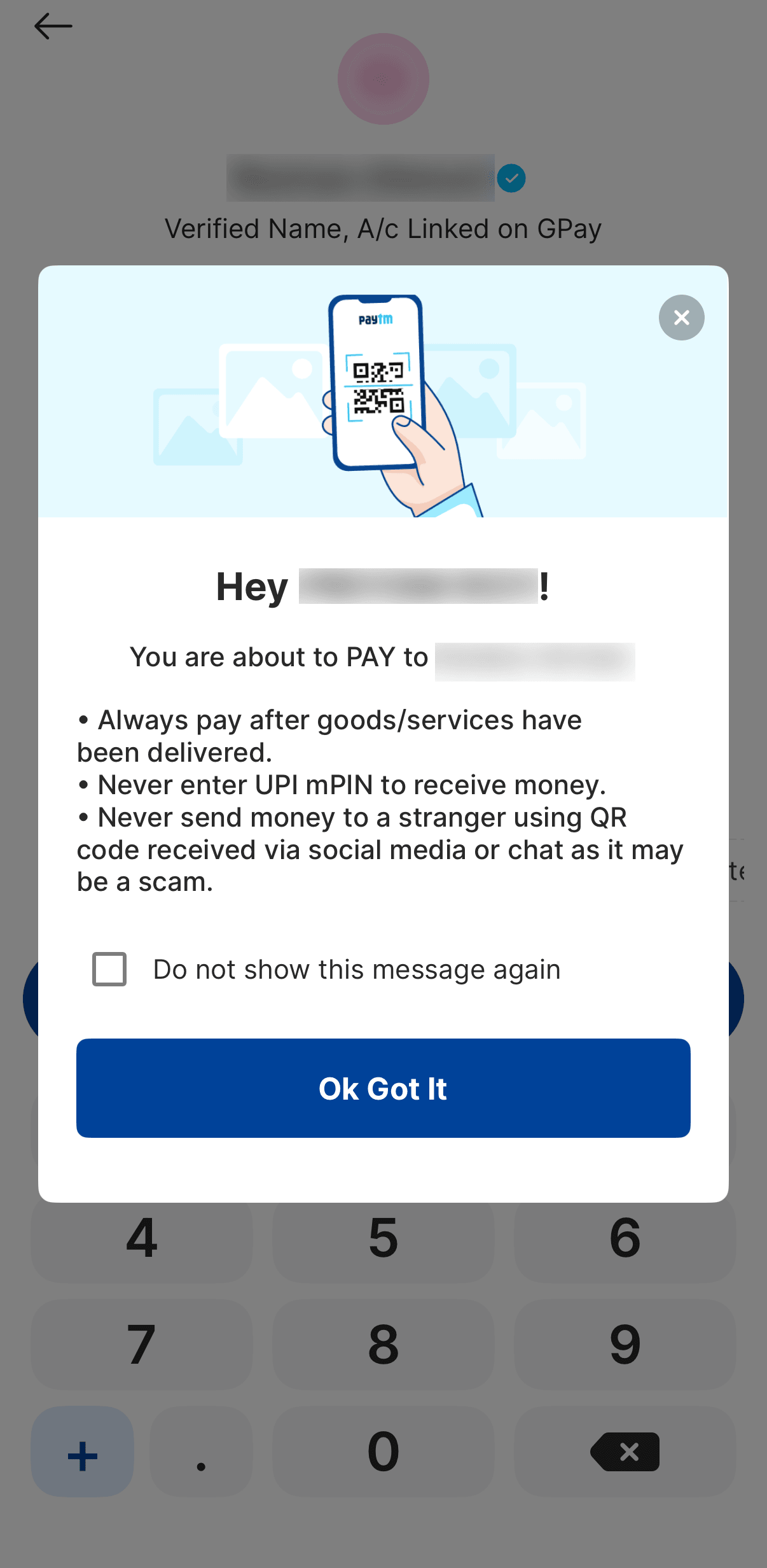
One thing I noticed and did not put in the table. Paying a merchant, Google Pay puts the amount and the account picker on one screen; paying a person, account selection gets a screen of its own. Same app, one step shorter, depending on who is at the other end. I have not measured the same pair in Paytm, so it stays out of the count and stays in my notes.
The home screens
| Google Pay | Paytm | |
|---|---|---|
| Tappable targets on the home screen | 40 | 76 |
| Targets that are a way to pay a person | 19 | 10 |
Home screen only, scrolled end to end. Nothing behind a "view all", nothing behind Google Pay's other tabs or Paytm's profile section.
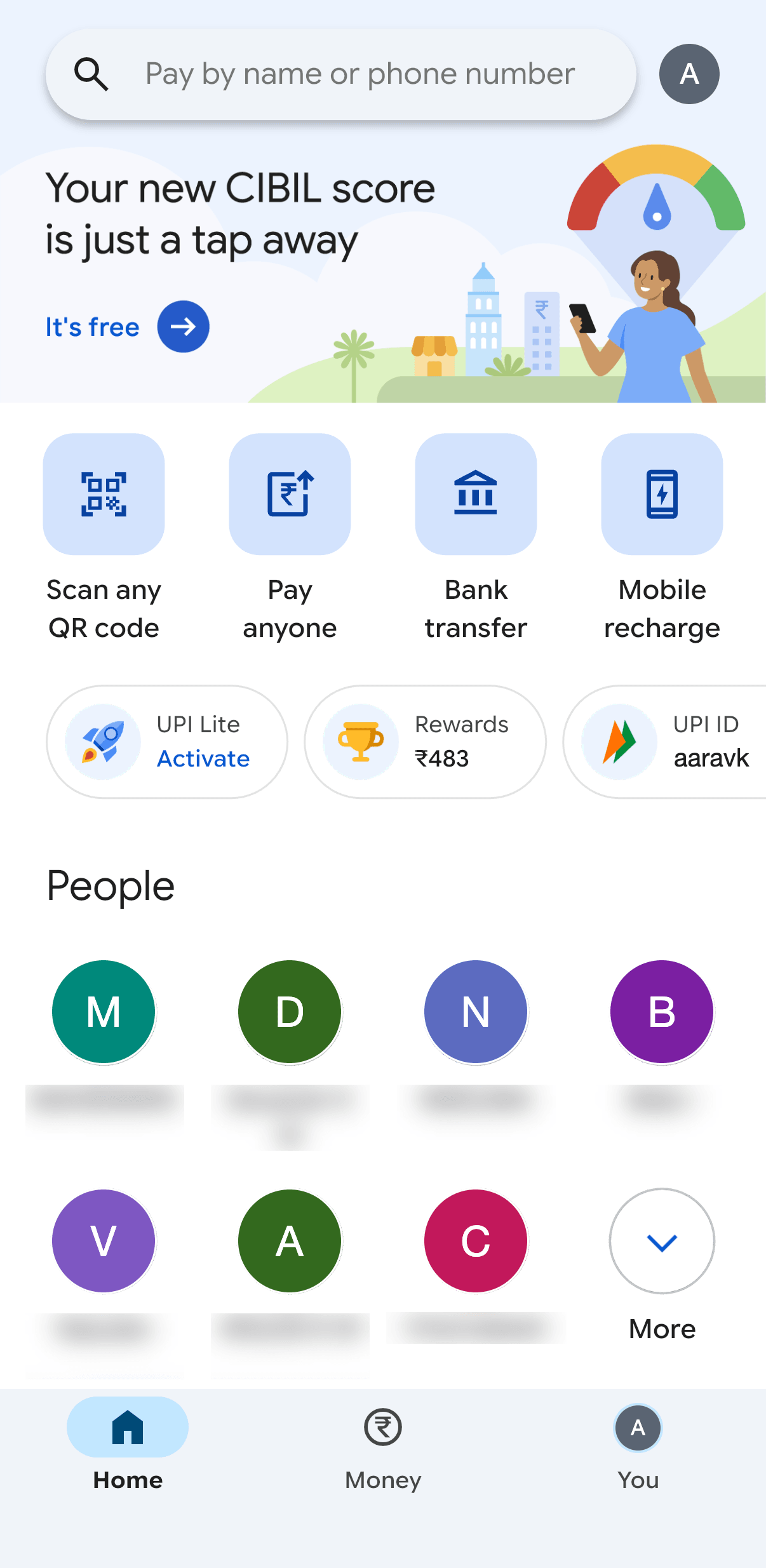
Half of what Google Pay puts in front of me is a way to pay somebody. An eighth of Paytm's is. Both open with the same row of actions, scan a code, pay anyone, move money to a bank. What sits under that row is where they part: Google Pay's next section is People, seven faces with names. Paytm's is Recharge and Bills.
One note for anyone counting along: both totals include the search field and the profile icon.
Google Pay
Paytm
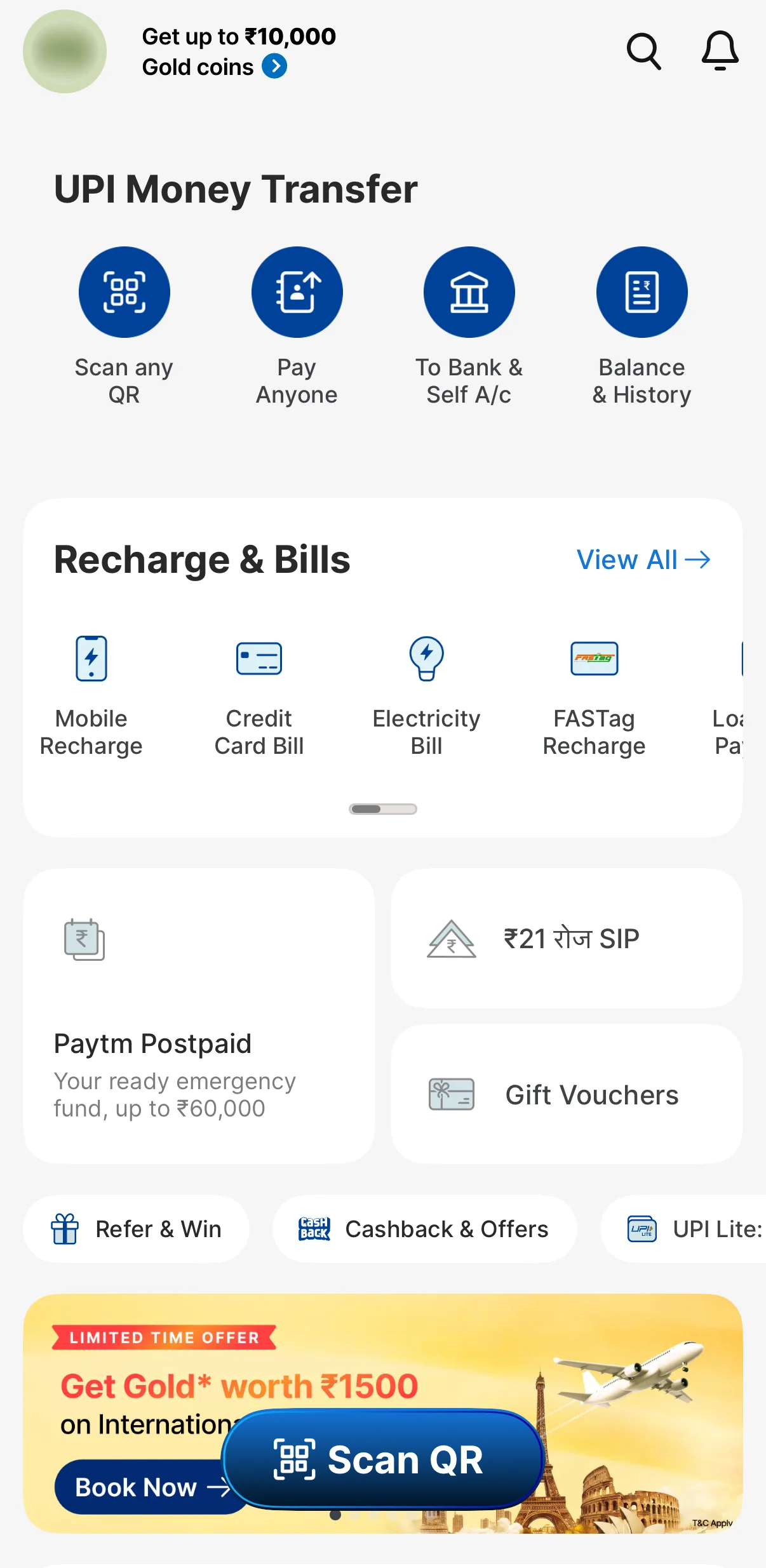
Both open with the same row of actions. Google Pay's next section is people; Paytm's is bills.
What I found instead
I still open Google Pay first. I just cannot say it is because the app is quicker, because in four flows out of four it is not.
What is actually different is how much I have to look past before I start. Forty things on the home screen against seventy-six, and the people I pay near the top of one of them.
That has a name, and it is older than either app. Jakob Nielsen's eighth usability heuristic, written in 1994, says:
"Interfaces should not contain information that is irrelevant or rarely needed. Every extra unit of information in an interface competes with the relevant units of information and diminishes their relative visibility."
That word relative matters. It makes the heuristic about a share rather than a total: whatever else sits on the screen makes the thing you came for harder to find. On Google Pay, 19 of the 40 targets on the home screen are a way to pay a person. On Paytm, 10 of 76. Half against an eighth.
It is also why the tap counts tied. Nothing in that heuristic is about steps.
Google Pay
19 of 40 are a way to pay a person
Paytm
10 of 76 are a way to pay a person
One square per tappable target on the home screen, filled if it is a way to pay a person. The arrangement is not the screen layout; only the counts are.
The people are a second one. Nielsen's sixth heuristic asks interfaces to minimise memory load "by making elements, actions, and options visible". Google Pay shows me a face and a name I recognise. Paytm shows me a category I have to match against whatever I came in to do. Both get me to the same PIN pad, and only one of them asks me to hold something in my head on the way.
None of that is proof. A heuristic is a design principle from 1994, not a study of how long anything takes, and naming a pattern is not evidence that I experience it.
What it gives me is a better description of my preference than the one I walked in with.
In my head a payment is a person before it is a transaction.
Google Pay's home screen is built the same way round: people first, and the payment is what happens once I have found one. Paytm organises by what a payment is for, so I have to turn the person I am thinking of into a category that will get me to them.
That is a mental model matching the one I already carry, or failing to. It is the explanation I am left with and it fits everything I counted, but it is still only mine. Counting taps was enough to kill my first answer. This one I cannot settle with a number. To know whether it holds for anybody but me, I would have to watch other people use both apps, starting with people who prefer Paytm.
What this doesn't show
- Paytm was always going to lose the second table.It is a super-app. Payments sit alongside ticketing, travel, gold, insurance and lending, and counting non-payment targets on a commerce platform proves it is a commerce platform.
- I did not measure time.Seventy-six targets against forty may cost something in finding things that a tap count cannot see.
- One device, one person, one sitting, on iOS.Most UPI payments in India happen on Android phones, and I have not checked whether either app differs there.
- I did not analyse PhonePe.
Where this went
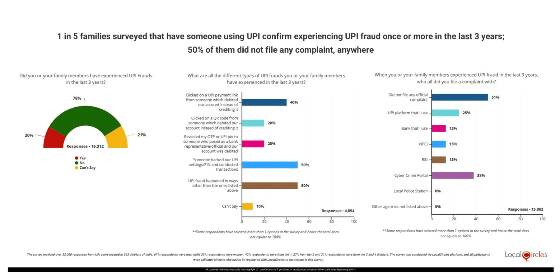
Looking for numbers on a preference is how I ended up in survey data about UPI, and that is where I stopped thinking about home screens. A LocalCircles survey run between March and June 2025, across 365 districts, found that one in five Indian families with a UPI user had been defrauded. That question drew 16,312 responses. Of the 4,894 people who said they had been defrauded, a fifth had scanned a QR code expecting to be paid, and paid instead.
So I went back to both apps and looked at how each one handles that: where the warning sits in the flow, what words it uses, and whether it arrives before the decision or after it.
The teardown this page sits under Whoever scans, pays What the Google Pay payment screen tells you about which way your money is going, and three ways it could say more.Still open
- The QR row needs re-taking.It may be measuring a merchant code in one app and a person-to-person code in the other, which are different flows with different steps. Until I redo it and label which is which, treat the 4 and the 4 as the softest line in either table.
- The merchant and person flows in Paytm,to see whether the one-step difference I found in Google Pay exists there too.
- The same counts on Android,where almost all of these payments actually happen.
Resources
Everything else here is first-party, counted by hand on 24 August 2026.
LocalCircles, UPI fraud survey, June 2025 Over 32,000 responses across 365 districts, fieldwork March to June 2025. Each question drew its own base: 16,312 for whether a family had been defrauded, 4,894 for how. Jakob Nielsen, 10 usability heuristics for user interface design First published April 1994. Heuristics 6 and 8 are quoted above.